Anatomy of a WordPress Migration: The Great CTS Guides Move
by Jason Unger, Founder
Insights / Content /
Back in the mid-1990s, I had some reasonable success creating and developing websites mostly related around my passion at the time – baseball. (I still love baseball – Go O’s – but this was a high point in my love of the game.)
The biggest hit of them all was a site called HyperBaseball.com, which had original articles, fan polls, an email newsletter – the works. For a site built in the ‘90s, it was pretty forward thinking.
But one of my biggest pain-points was design. I was always looking to improve the design and layout of the site, from the branding to the promotion of related content to general graphic usage. And since this was the ‘90s, there wasn’t really a way to manage these types of design changes site-wide.
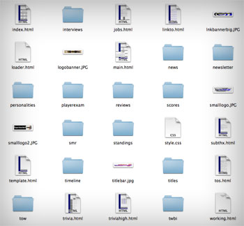
 Each page on the site was its own HTML file, with code independent from the other pages on the site. They all had the same layout, but they weren’t linked in a way that made them easy to manage or update. So whenever we had to make a design change – or even a total rebranding of the site – we needed to go through and update every single HTML file with the changes. That meant every article and every page had to be updated by hand with the adjustments.
It was an incredibly time-consuming process, but it’s how we rolled.
Fast forward to the 2000s, and the popularity of content management systems began to grow. Now, you could effectively separate out the content of your site (managed in the database) from the design (managed in your template), so if you wanted to make a site-wide design change, you could.
PS. I’m skipping past the whole server-side includes phase of web development, but if you were there you know what I mean.
In today’s web world, content management systems (CMSs) like WordPress, Drupal and Joomla make it easier than ever to keep the site design fresh and useful without having to make drastic changes to your actual content. We’ve moved beyond the static sites of the past for new, database-driven dynamic sites.
But what if you’ve got an older static site, still grappling with individual HTML files where the design is literally linked to the content, and you need to find a better way to manage your site?
That’s when it’s time to make a big movie.
CTS Guides: Powering Software Decisions for 30 Years
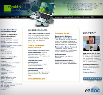
The team at CTS Guides, which delivers unbiased, personalized software advice for businesses in a number of markets, found themselves in a situation where they had more than 500 pages on their ASP-powered website – and each page was its own file, with design and content linked together.
So, you can imagine, when wanting to make a change – even something as simple as updating the year in the copyright statement of the footer of their site – it could be complicated. You’re talking about updating 500+ pages individually, or trying to run a search and replace, overwriting all of the files on the site, and hoping everything turns out OK.
It’s not an impossible situation, but it’s not ideal. Sites dealt with this all the time in the ’90s, but today, you’ve got to be able to make changes easier. CTS Guides made the decision to migrate to a real content management system – in this case, WordPress – in order to more effectively manage and update the site.

And as anyone who’s versed in the web will tell you, making this kind of move is not something you suddenly decide on. There’s a lot of factors involved.
After going through the site, here’s what I’m thinking about the project:
- We need to map out where all of the content lives, whether it’s in a tree structure or independent of other pages on the site
- We need to understand the design differences between the different sections of the site
- We especially need to plan out URL changes and prepare redirects for all of the content, if we want to ensure search engines don’t change their treatment of the site
But as we discussed, despite the challenges in this project, this is the type of move that would have to be made at some point in order to effectively manage CTS Guides’ online presence. If they ever wanted to do a real redesign or change up the branding, they’d have to bite the bullet and get into a database-driven system like WordPress – so it simply made more sense to make the move before a big redesign was needed.
Planning, Planning and More Planning
There’s so much that goes into doing a migration like what we did with CTS Guides’ site.
What’s common to all of the pages? What’s different about each page, or each set of pages? Where does the content begin and where does it end? What’s a sidebar widget and what’s built into a unique template?
How is the content organized? Are there specific sections to the site? What about content that doesn’t belong to any section? What are search engines currently seeing on the site? What will we need to tell them when we make the switch? How are meta tags and keywords being handled?
You could almost go cross-eyed trying to think it all through. But here’s what we did to make this manageable:
Start with an Understanding of Content
If we knew how all of the content related to each other, we could set up a sitemap that gave a general idea of what design templates we needed. For example, if we’re talking about construction software reviews, they’re all getting one template – or if we’re discussing CRM software, they’re getting a different template.
Mapping out the content made it 1000x easier to turn 500 individual pages into a dozen or so different templates.
Find Commonality in the Design
Once we’ve got our sitemap established and the number of templates we need set, the next goal is to determine what parts of the design we can safely use across all of the templates.
For most simple sites, you’ve got five basic areas of design commonality: the header, the footer, the left sidebar, the right sidebar and the main content area. There are obviously variations on this, but in general, it’s a good rule of thumb.
In this case, it was clear that all of the site footers would be the same. Easy enough. But each section had a slightly different header, so we needed to add logic to determine when to show the appropriate header.
When it came to the left sidebar, right sidebar and main content area, it became obvious fairly quickly that there was a lot of variation between the different templates, and sometimes even within the template. It’s one of those things that just happens over the course of growing a static site – a slight difference here or there can add up, especially over the course of 15 years.
One thing to remember: our goal with this migration was NOT to redesign the site. It was to keep the look and feel intact while making it easier to manage and update through WordPress. So while we took a grain of creative liberty to fix the smallest inconsistencies, generally every page looks exactly as it did before the switch to WordPress.
Migrating the Content
For a site with more than 500 pages, you can imagine that migrating the content was a big deal. And yes, it was a big deal.
Because of the nature of the pages and the importance of the SEO descriptions, titles and keywords, it’s something that had to be done by hand.
Yup, you read that for real.
There’s no way to put together an effective script that would pull out the right content and organize it an a way where it could be automatically imported into WordPress. There are certainly options out there that say they could do this, but we couldn’t trust they would get it right – especially when each piece of content is so important.
So we did it all by hand. It took a long time, but thanks to the sitemap we previously created, it made it much more manageable.
Flipping the Switch, and Tracking It All
When we were ready to go live with the WordPress-powered version of the site – I’m skipping past all of the testing that happened because there was a lot – the first thing we wanted to do was ensure all of our bases were covered.
For this project, that meant making sure that every old URL was properly redirecting to its new URL, and that we didn’t miss any pages in the process. Google had indexed hundreds of pages on the CTS Guides site, and now they were all at different URLs. It’s not something you take lightly, especially when search engines drive a substantial chunk of your traffic. We worked with Shane Powers of PowerBusiness.com to crawl the site right after it launched and hunt down any issues: 404 errors, redirects not working, etc.
The site is live, and everything is working as it should be, but we’re still tracking to ensure that there’s no drop-off in search engine or referral traffic. It’s a must. So far, it’s looking good.
Laying a New Foundation for Success Online
There’s a lot of new opportunity for the CTS Guides site now that it’s powered by WordPress, from the ability to do a complete redesign to integration of blog functionality to improve search engine optimization.
This is the kind of move that business owners think long and hard about – and it’s understandable why. Things weren’t bad on the old site – but there wasn’t really anywhere to go. Making the investment in a WordPress migration has laid a foundation for new success online for CTS Guides, and we’re glad to have helped them do it.


