Reading Your Mind: How Psychology Plays a Role in Web Design
by Gina Armstrong, Lead Designer
Insights / Website Design /

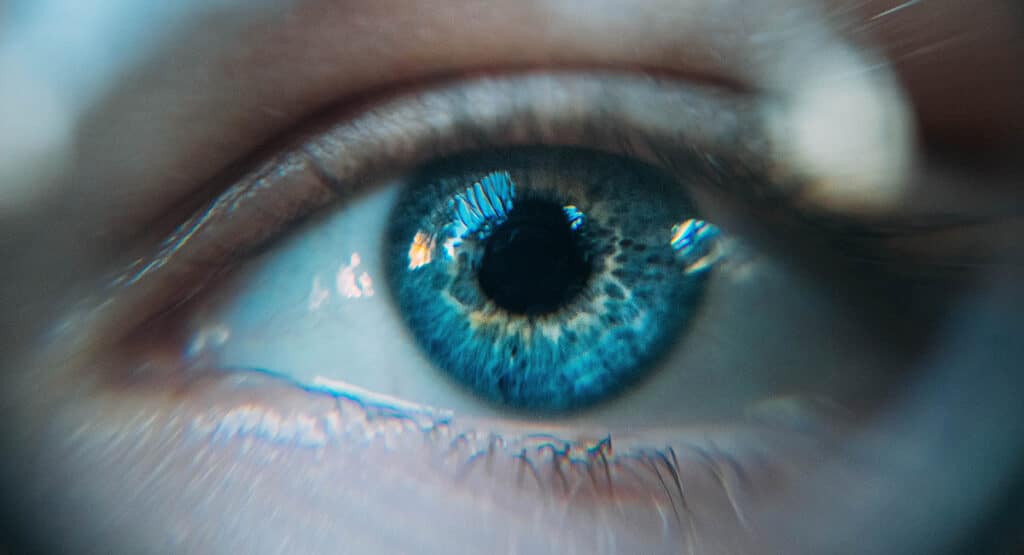
Photo by Milad Fakurian via Unsplash
When starting a website redesign, you may begin by excitedly gathering inspiration and compiling a list of sites you like. While this is a valuable step for communicating the look and feel you’d like to establish, building a successful user experience requires more than a series of style choices.
Our design process usually consists of a discovery phase followed by creation of wireframes and then mockups. As we work through these milestones, we spend a lot of time thinking about things like branding, accessibility, and audience. In order to craft a visually engaging site, we make design decisions based on psychology and user behavior.
Here are four user traits we consider as we curate user experiences for the web:
1. Snap Judgment

Photo by Ion Fet via Unsplash
The human mind is perpetually evaluating its surroundings, often unconsciously. As designers, we’re well aware of this evolutionary phenomenon. We know that when a new user lands on a site, they make a series of snap judgments that determine how long they stay before bouncing.
For this reason, it’s important that a site feels authentic and representative of its brand. Colors, imagery, and typography should be chosen intentionally to accurately represent the brand’s ‘personality’. Design that doesn’t align with that voice may confuse people and will ultimately steer them away.
Beyond that, you’ll also want to avoid these other common mistakes.
2. Information Absorption & Processing

Photo by Firmbee.com via Unsplash
In the wireframing process, our task is to consider the user’s journey through the page as we plan the site’s architecture.
Since we understand that people commonly read in a zig zag or ‘F’ shape patterns, we know that key information should be placed in those areas. We can also employ graphic elements to help guide their eye to the important information.
Since users don’t want to spend time digging around for information, scannability is crucial. We want to streamline text, and make sure there’s plenty of white space to allow your content to breathe. Implementing a clear hierarchy on the page is another way to build visually interesting and easily understood web pages.
3. User Interaction & Expectations

Photo by Kaboompics.com via Pexels
When we design a site, it is important to think about the way our design decisions impact the user’s expectations. For example, if buttons and links are red throughout a site, we avoid using that same color for subheads or regular text because it would lead to confusion about what is and isn’t a link.
Along these lines, we also know there are expectations that hovering over any clickable item usually results in some kind of change be it color, underline, movement, etc. It’s important to meet user expectations, only diverging or building upon these learned behaviors sparingly.
4. Emotion-Driven Action

Photo by Karsten Winegeart via Unsplash
For mission-driven websites, especially non-profits, there are often opportunities to create emotionally-compelling stories or visuals. But before we can design a site that pulls at the heartstrings or inspires urgency, we first have to determine who the audience is.
Knowing who you’re designing for makes the difference in whether your design will successfully drive them to take action or not. For instance, we know color psychology plays a huge role in creating an emotional reaction. Typically, a color like blue is associated with serenity or trust, while orange can be used to evoke energy or excitement. But the impact of color can vary greatly depending on age and culture, so having that context is key.
We can also influence user emotion by incorporating social proof. Websites that display case studies, client testimonials, or awards often help persuade users to engage by earning their trust and acceptance.
Taking these elements into account helps ensure we create compelling designs that accomplish your goals. If you need help creating a website, reach out to us.


