Make Your Website User-Friendly in 3 Easy Steps
When we’re talking with our partners planning a website redesign, one of the first things we usually hear is that the site needs to be easy to use.
We understand that balancing content, design, and functionality can be tricky – and it’s why preliminary steps like establishing the sitemap and designing wireframes are crucial.
Beyond that, there are a few core principles we follow that help make any site user-friendly.
Straightforward Navigation
The target audience is central to any website design, but when it comes to the navigation, it helps to design for someone who is completely unfamiliar with your organization.
That means using straightforward titles for menu items, and avoiding buzzwords or brand-specific phrases. You also want to follow a menu structure that is intuitive and easy to follow.
For example, most visitors will expect to find the “Staff” page under a parent tab like “About”, so it’s important that your menu aligns with these expectations. Even larger “mega-menus” should be designed with simplicity in mind.
Lastly, it always helps to include a search function for users who can’t find what they need at first glance.
Hierarchy
You’ve probably seen a version of this popular graphic floating around the Internet. Thanks to visual hierarchy (and an understanding of reading patterns), it’s no surprise that we read the sentences in the order specified.
As a system, hierarchy helps users understand the importance of various pieces of information on a page. Attributes like color, font size, and grouping help to distinguish elements from one another. Typically, our attention is drawn to large, bold, and colorful items first.
On a website, having an established visual hierarchy makes it easier for users to navigate because they can quickly discern what’s a header vs. body text, and where to click for more information.
White Space

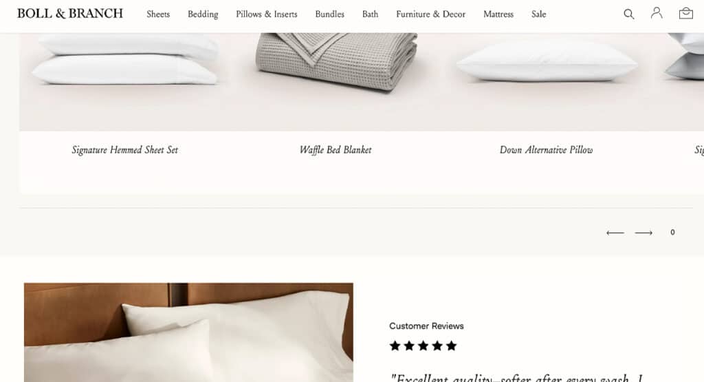
An example of white space that makes the page feel peaceful and elevated (Boll and Branch)
Visiting a page that’s overloaded with content can quickly become overwhelming and frustrating for a user, sometimes to the point of them leaving the site.
On the other hand, having white space helps make the page scannable and easy to understand by providing the eyes with areas to rest. To achieve this, make sure there is plenty of padding between elements, and that content that is mapped out in a way that doesn’t feel too repetitive or heavy. We always recommend keeping text to a minimum for the best user experience.
(Keep in mind that white space can utilize various colors – it just means that there are areas without text, images, or graphics.)
Transforming a clunky website into something sleek and user-friendly might seem daunting, but following these basic fundamentals is a great first step. If you need more help re-imagining things, we can help – reach out to us.


