Tools We Use: Adobe XD

This is the tenth in an irregular series of blog posts about the tools we use to design, develop, and maintain websites and the digital products we create. We’ve previously written about Slack, Soliloquy and Cycle2 sliders, the Pingdom Website Speed Test, Sprout Social, Chrome Developer Tools, Free Stock Photos, Google Webmaster Tools, Font Awesome, Glyphicons, and Dashicons, and the Wacom Intuos Pro pen tablet. In this installment, we discuss Adobe XD.
Adobe XD is a web design and prototyping app that has become the primary and essential tool we use for web design.
Before XD, like a lot of web designers, we used Photoshop as our primary web design tool. However, because Photoshop wasn’t built specifically for web design, it was an often frustrating and inefficient process.
Adobe XD was built specifically for web design, so using it has freed us from forcing Photoshop to be something that it was never intended to be. With XD, the process of designing websites is much more enjoyable and effective.
How We Use Adobe XD
Adobe XD allows us to quickly sketch multiple wireframes, turn those wireframes into high quality designs, and test those designs as functioning prototypes, all while being able to collaborate between our design and development teams in real-time.
With XD, we set screen sizes with columns, grids, and guides that can be easily set to match standard development frameworks like Bootstrap. Those screens can also be set to move elements around automatically as the screens are resized, making it much easier to implement responsive design.
Once we have a basic wireframe, we can use XD to create font and color styles that can be applied as we build out each page. This ensures that everything looks consistent from design through development.
As we build out our design, we use a library of plugins that are constantly being added to by a large developer community to further elevate the design experience.
Examples of plugins we use frequently include:
- Icons 4 Design – A plugin with icons from sources like Font Awesome that we can drag and drop into the design.
- Lorem Ipsum – Customized placeholder text we can use to fill in sample content.
- Unsplash Random Image – A plugin that lets us add random high quality images from Unsplash directly into our design.
Team Work Makes the Dream Work
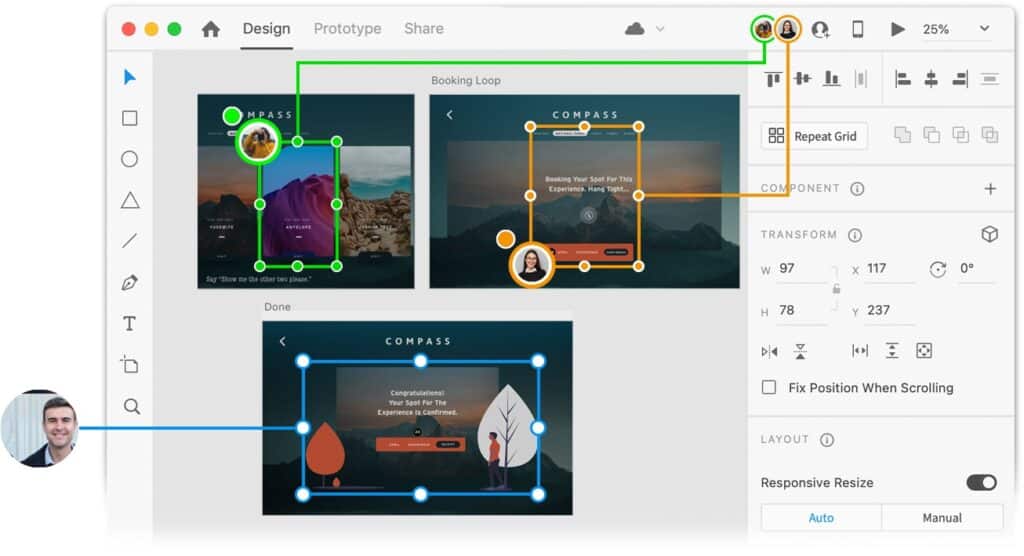
One of the coolest features in XD that we use from time to time is live, simultaneous collaboration. One of us can be wire framing pages while another is simultaneously building out specific design elements on those pages.

Photo by Adobe XD
You can see it happening live, just like a Google Doc. For a remote team like ours it comes in handy, especially when we need to demonstrate or explain our design ideas.
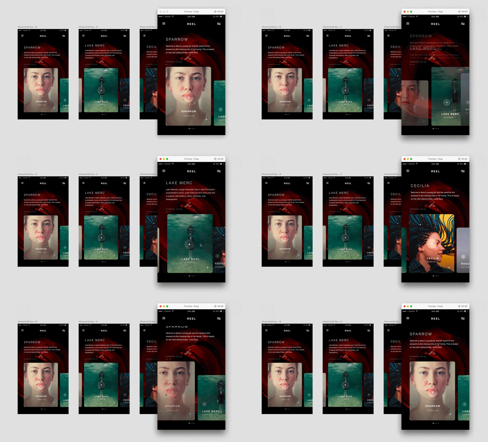
In order to test and present UI/UX like navigation menus, we set up flows in XD with fairly robust animation and transition effects that help us and clients know what to expect of a design before it gets to the development stage. You can even connect a mobile device with a companion app that lets you interact with the design as if it was on the device.

Example by Elaine Chao
Once we’ve built out the design and it’s ready for development, we share the design from within XD, which spits out a URL that gives us everything we need for development. The shared URL settings can also be modified to only show the design in order to present the prototype for client review.
Adobe XD has become an amazing and helpful tool within our workflow process. With everything we summarized above, and the way that it ties together with the other Adobe Creative Cloud tools, it should be an essential tool every web designer uses.

