The Importance of Having an Effective Call to Action
by Jason Unger, Founder
Insights / Content /
There’s nothing more important than having a goal for your website.
It’s so much easier to build a site today (compared to the earlier days of the Internet) that it’s easy to take the mentality of “Let’s just throw something up there and see what sticks.” Or, as often happens when things get a little too complicated, your site (and your entire digital marketing effort) turns into a bunch of different objectives all trying to serve different people … and you end up serving no one.
So once you figure out exactly what you are trying to do – and it’s not 11 different things – it’s as few as possible – it’s your job to make it clear to the user what they are supposed to do.
Let me give you an example.
This past weekend, I needed to download some software from HP for a new printer. For some reason, my Mac wasn’t able to obtain the drivers on auto-install, so I had to go to the HP website to download them.
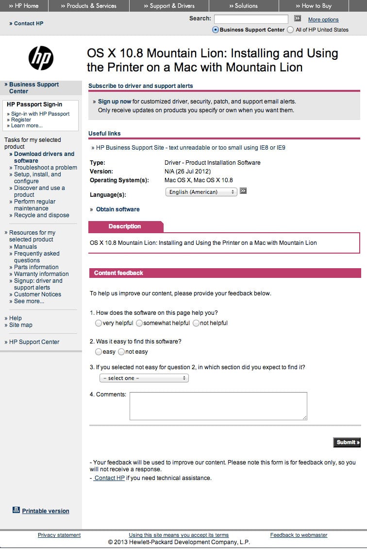
After searching for the model on Google, finding the link, then clicking through to the page to download the drivers for my version of OS X, this is the page I landed on:
You’re a user of the HP website, looking to download the drivers. How do you do it?
If you’re anything like me, you saw the little grey button with arrows in it next to the dropdown, the pink bars that say “Description” and “Content Feedback” and then the “Submit” button.
It literally took my three scans of the page to find the small little text link that says “Obtain Software.”
See it now?
Exactly.
This is an example of a bad call to action – which, in marketing-speak, is the action you’d like a user to take to interact with your product or service.
A call to action doesn’t necessarily have to be “Buy Now” – it can be “Click here to download our trial” or “Enter your email address to get our free newsletter” or “Read the full post.” Or, in this case, download the software.
Your call to actions online and in your email and social media outreach need to be clear and they need to be obvious. Here are some great examples of call to action in website design and here are some tips on calls to action that turn website visitors into leads.
Remember: your users don’t have time for you. They are doing so many other things, and if they aren’t able to get what they need from you, they’ll get it from someone else. And in the case of HP – since I couldn’t go anyplace else to get them – I’m an annoyed user who’s unhappy about the experience.
One might say that it’s better to make your site a little confusing so that users stay on the page a little longer and find new things. Guess what? Bad idea. They’re not going to happy, and if they don’t actively let you know about it, they’ll either not come back or tell their friends not to.
Anytime you’re creating a page on your website, or email, or Tweet, think about the end goal: what are you trying to do? From there, figure out what the user needs to do to fulfill their end of the deal. Make it clear to them and they’re more likely to do it.


