Testing Out Adobe’s New AI Features
by Gina Armstrong, Lead Designer
Insights / Graphic Design /

Adobe recently started implementing some new AI-powered features into its design software – and although many people oppose the rise of AI-generated art, it’s undeniable that these advances in technology offer time-saving tools. To get a better idea of how Adobe’s features work, and whether they might improve our workflow, we decided to test out a few of the newest offerings.
Here are our first impressions of the four that we tried:
1) Photoshop Generative Fill
Photoshop’s Generative Fill feature allows users to create seamless edits or additions to any image.
To try it out, I started with an image of the mountains. Using the select tool, I highlighted the foreground of the image and typed in “add fall foliage”. After a few seconds, the image was transformed – and it looks fairly realistic. I decided to go a step further and added a person to the image. Each text prompt that you enter provides you with a few options you can select from, which is a nice feature for really customizing things.
First impressions: The results aren’t perfect – some of the finer details like lighting and rough edges could use tweaking. Still, I’m impressed with how easy it is to use and think this is a promising tool for editing and customizing images.
2) Illustrator Text to Vector Graphic (Beta)
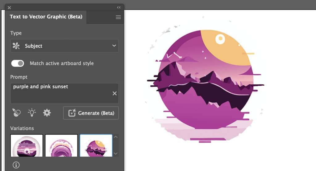
Similar to Photoshop’s Generative Fill, Illustrator’s Text to Vector Graphic (Beta) tool takes your text prompt and creates a vector graphic.
Your graphic options are subject, scene, icon, or pattern – and there’s a “style picker” included, which you can use to create style references. Once the initial graphic is created, you can also peruse and easily apply various color schemes. The customization options are great, and overall the process feels smooth.
First impressions: This could potentially be a huge timesaver in the future. It could be particularly useful for quickly creating customized icons.
3) Illustrator Retype (Beta)
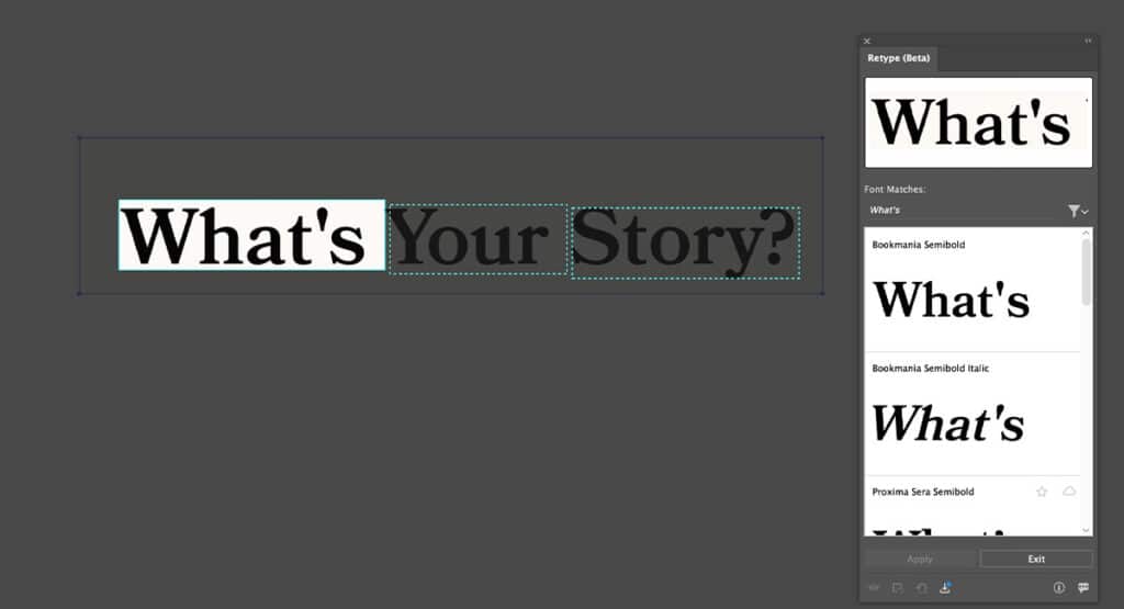
I grabbed a screenshot from our website to test out Illustrator’s Retype (Beta) feature. It works by taking a raster image (jpg or png) of text and converting it to vector format, enabling you to edit the text directly. It only took a few seconds and Illustrator correctly identified the font as Bookmania Semibold. If the font in your image isn’t available through Adobe Fonts, the tool will suggest a similar looking font.
First impressions: This is a nice integration to have to quickly check what font is in an image, but may be less helpful if you need to edit a font that isn’t readily available through Adobe.
4) Illustrator Mockup (Beta)
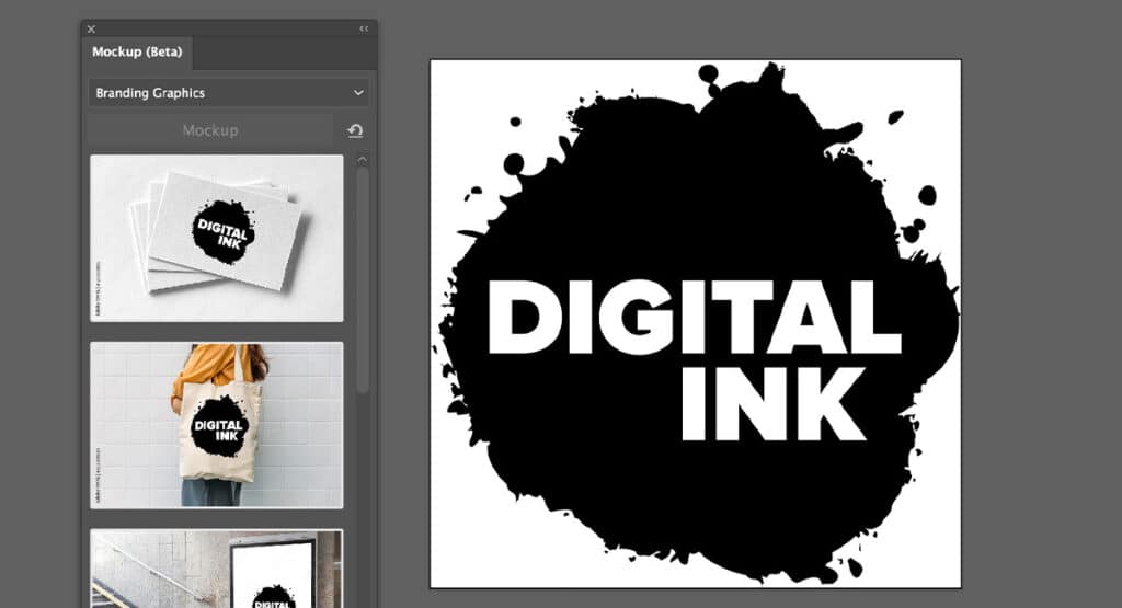
The last thing I tried out was Illustrator’s Mockup (Beta) tool. I was excited for this one because selecting an appropriate mockup can be incredibly time-consuming and often requires some level of customization. Now, instead of sifting through pages of pre-existing mockups, you can simply use this tool to select the type of mockup you’d like – the current options include: apparel, branding graphics, digital devices, or packaging.
It’s integrated with Adobe Stock, so each option brings up a library of stock images to choose from. Since images are pulled from Adobe Stock, you will need to purchase any image you select. The available options seemed pretty limited, so I’m hoping they will expand them in the future.
First impressions: Although the image options are limited, I think this is a promising feature and one I’d definitely use in the future.
Overall Impression
These tools were fun to test out – and given that they’re still in Beta versions, I think they worked pretty successfully.
As designers, we’re always looking to streamline our process and save time, which is exactly what these offer. We’re excited to continue to explore and see what other integrations Adobe will offer in the future.
Have questions about using AI or need help with your next project? Reach out to us.


