Why Your Brand Needs a Style Guide

Does your brand have a style guide?
A style guide distills the essence of your brand – your mission, your look and your feel – and translates it into a set of rules to help you maintain consistency in everything you create.
It’s essentially the Ten Commandments of design for your organization, except that instead of being carved in stone, it’s a living document that is slowing changing and adapting along with your business over time.
Think about it this way: would you travel somewhere new without a map? Sure, you’ll probably get there eventually, but having exact directions will get you there much sooner — and without a lot of frustration along the way.
This is what can happen when you bring onboard designers, agencies and freelancers without a style guide: they need to figure out the rules of the brand. Having a style guide helps you, your entire organization, and your partners to create new projects that have the same look and feel no matter who’s making them.
Here’s how to build a style guide for your brand.
Gather Your Branding Inspiration
Let’s assume that you have some basic branding elements, like a company logo or basic marketing collateral you’ve created in the past.
Gather them all – preferably printed out in front of you – and try to find common elements.
Are there one or two fonts that you use on everything? What about colors? Or photos? Narrow these elements down to those that appear the most frequently.
If it feels like your materials aren’t communicating exactly what you want your brand’s message to be, look for outside sources of inspiration.
A good place to start is your competitors and other companies whose branding or messaging you admire. What do you like about those examples? How can you integrate and emulate their style in your own voice?
Elements of a Style Guide
Once you’ve gathered your materials in one place, organize them into a cohesive guide.
There’s not a standard format for all style guides, but most generally have the following sections:
Mission
Think about the core beliefs of your organization. What are your goals? What’s your mission?
Having these tenets clearly stated and written down is the basis for everything in your style guide.
Logo
How is your logo meant to be used? Are there alternate versions of your logo? How should they be used?
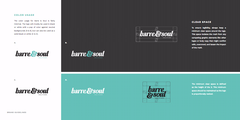
For instance, how much space does your logo need to have around it? What is the smallest size it can be while still being legible? Can it be overlaid on bright colors, or only black or white?
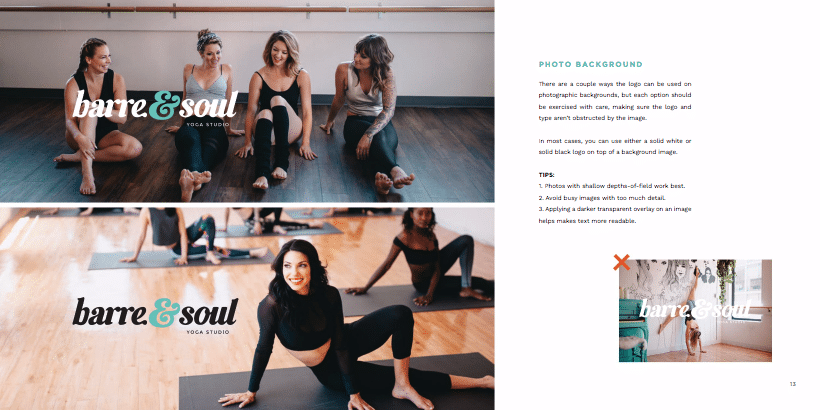
Barre and Soul’s Logo Usage Guidelines
What about photos? Does the subject of the photo matter? How visually busy can the photo be and still have the logo be legible? Or does the logo need a dark transparent overlay between the logo and the photo?
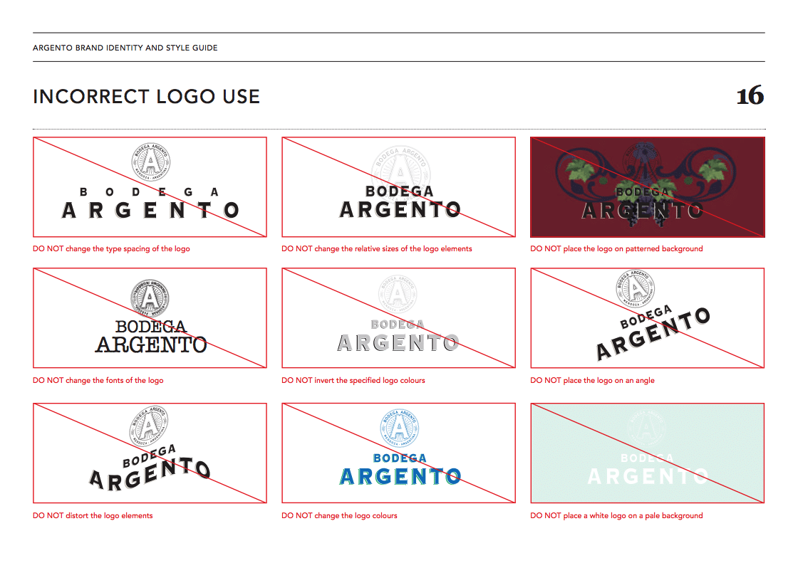
Make sure your guide clearly states if the logo can be manipulated in any way, or if it must be used as is.
Bodega Argento’s Incorrect Logo Usage
Color Palette
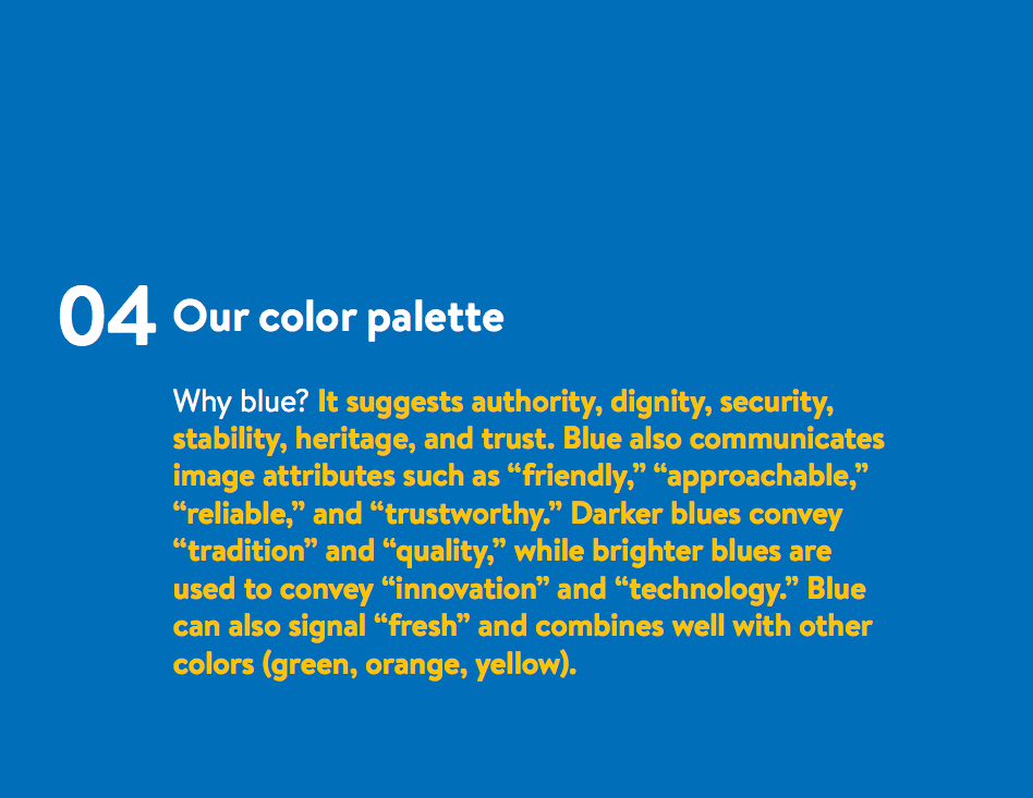
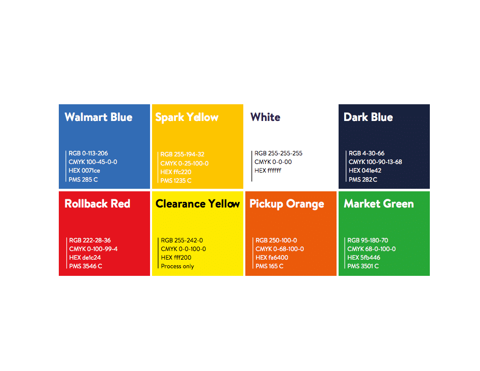
To create a consistent look across all of your materials, limit your brand’s color palette to primary, secondary, and possibly tertiary colors.
Because of the differences in how colors are rendered on screen and in print, be sure to provide the RGB, CMYK, HEX, and Pantone values for each color in your palette.
Typography
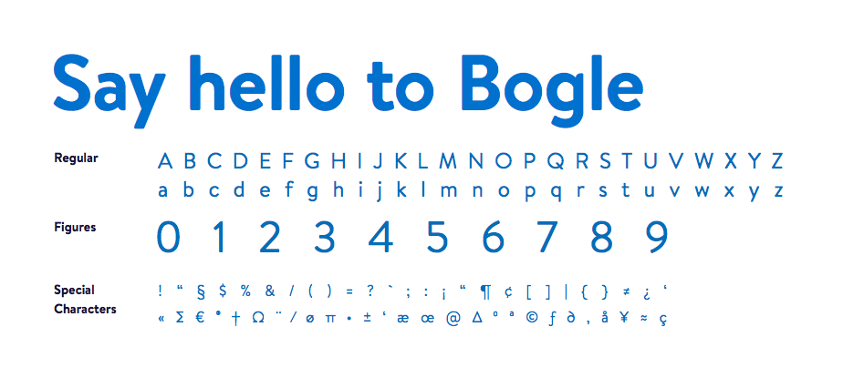
Good typography gives your designs and other materials structure and is key to making sure everything has a consistent look and feel.
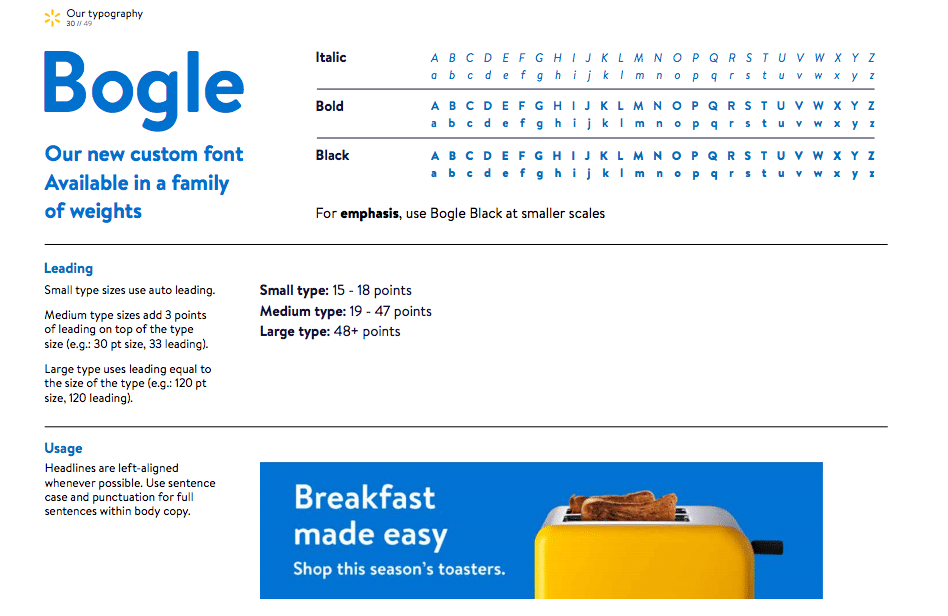
Your style guide not only needs to clearly list what fonts are allowed, but also their acceptable weights, sizes, and styles.
It’s also helpful to list out the proper hierarchy of type. For example, maybe your primary font is displayed at 12pt size with an 18pt line-height, while your headers should always be 36pt size with a 48pt line-height.
You can also include variations depending on the medium, such as whether the type is being used for print or for the web.
Imagery
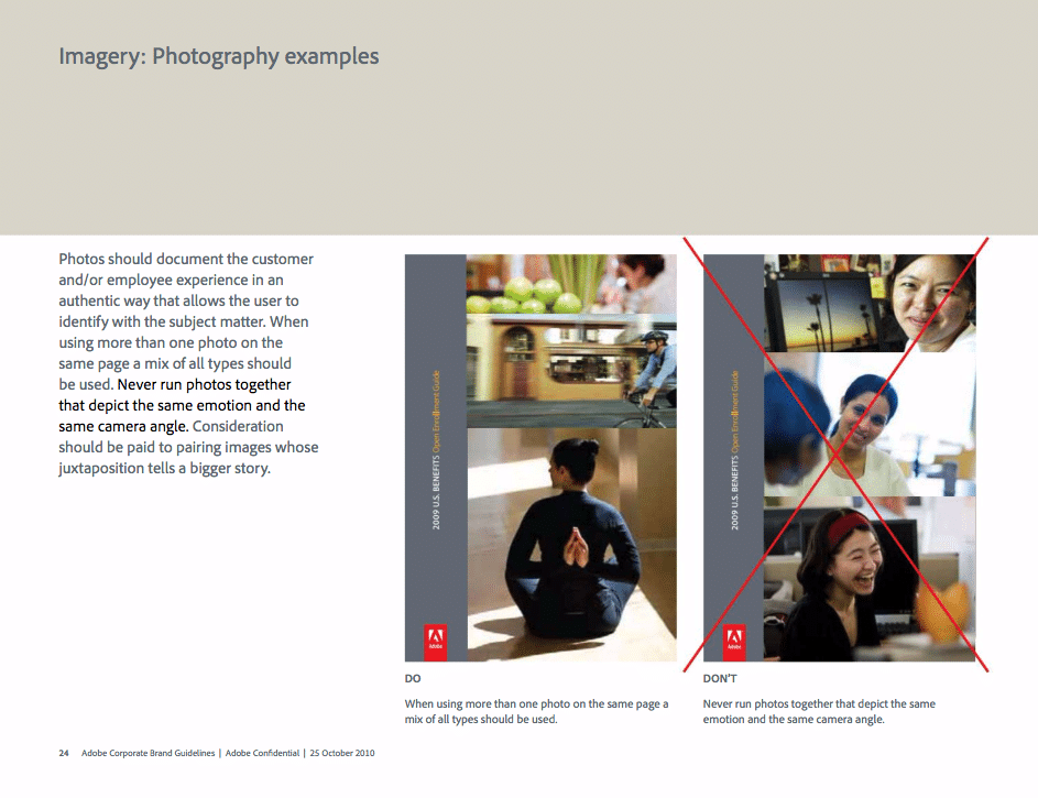
What kind of photography communicates your message the best? Does it depend on the medium?
What kind of subject matter should your imagery have? People, landscapes, buildings, or something else? How should the photos be cropped?
Is there a specific color temperature, like warm or cold, that they have to be? Can they be black and white?
All of this needs to be clearly written down in your style guide, along with visual examples for each.
Voice
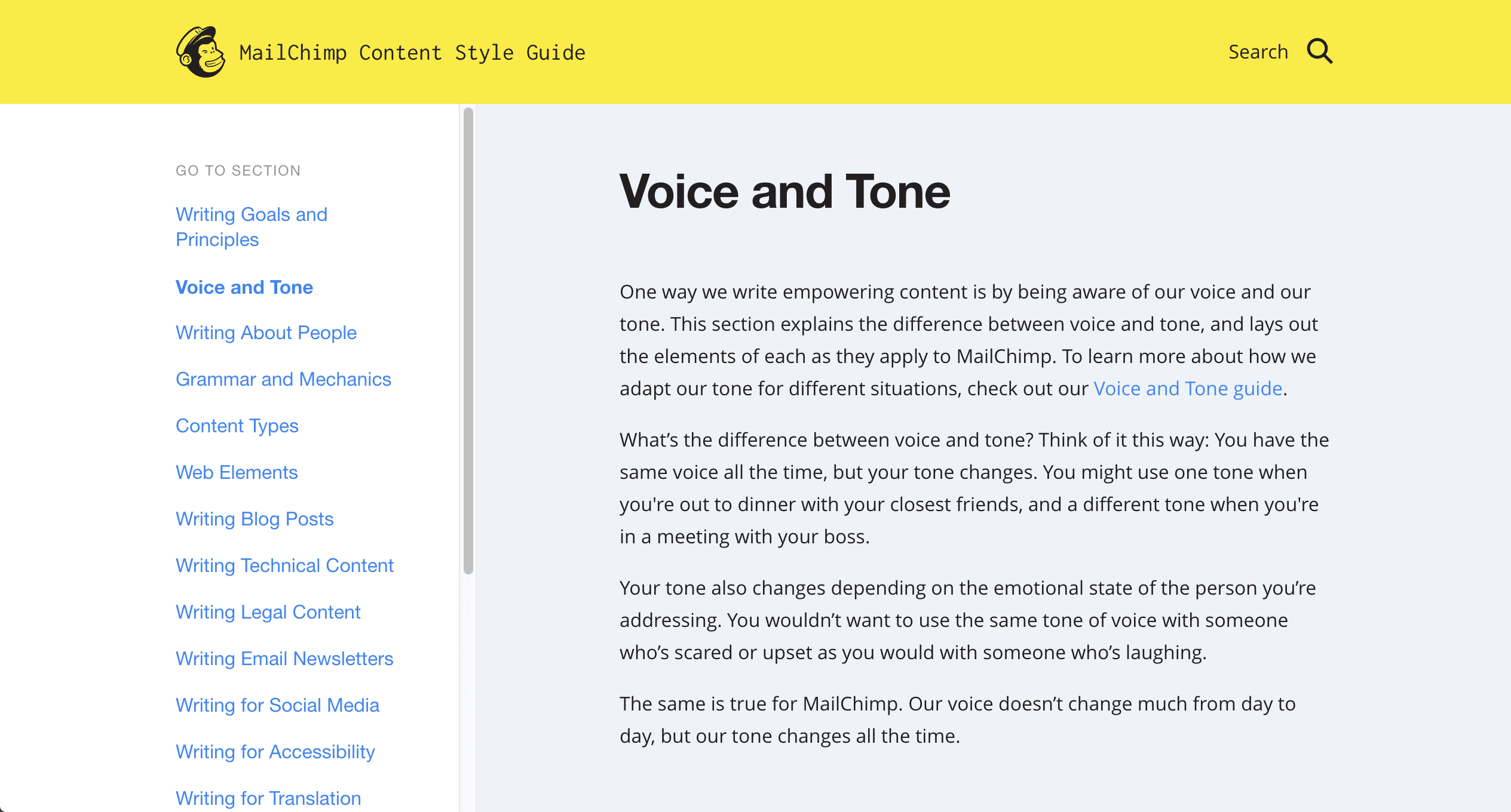
MailChimp’s Writing Style Guidelines
For companies that create a lot of written content, it’s crucial that your style guide makes it clear what kind of voice your brand’s writing should have.
For example, should your writing always be fun and casual? Or professional and conservative? Should everything be proper case or sentence case? Does your company use MLA or APA style?
Business specific elements
Are there additional elements that your style guide should include?
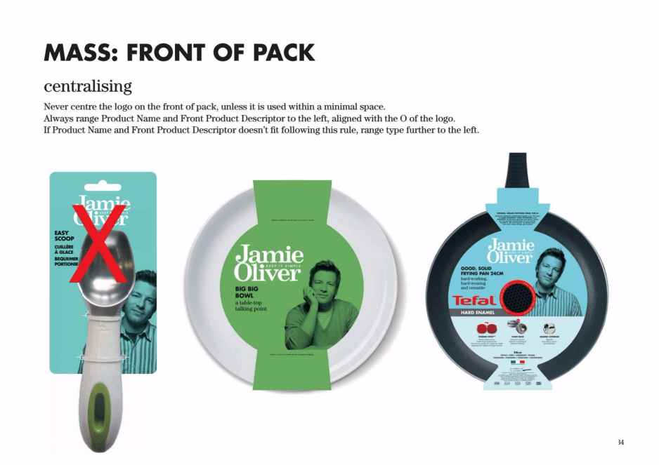
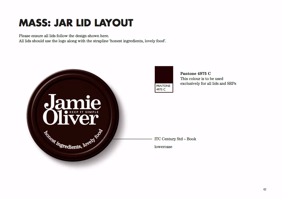
For example, if you produce a lot of packaging, elements such as color and typography will still apply, but you also need to clearly state where your label should be on the package. Or does logo placement change depending on the type of packaging?
Jamie Oliver’s Packaging Guidelines
If you’ve already done the first step and examined what kind of messaging your company has and what it produces, then this should be pretty straightforward.
Planning Your Style Guide for Change
The evolution of Starbucks’ logo style
You change over time, and so does your style.
Style guides aren’t written in stone and will constantly evolve over time.
As you put your style guide together, remember that your rules can (and will) change.
Keep a log of ways your brand’s style could improve, and find and store real-life examples in a design journal. Periodically sketch or jot down ways to improve your brand’s style, and use the feedback you get on your work to make changes to your brand’s style.
Knowing when to make style changes might happen suddenly, but most likely you’ll changes things gradually. When you notice that your brand’s style has diverged significantly from your guide, you’ll know it’s time for a refresh.

