Creating Responsive, Curved Underlines Using Browser APIs and CSS
In the past, we’ve written about general case scenarios such as Cutting Down on Form Spam or Adding Custom Buttons to the WordPress TinyMCE Editor.
Today, however, we’re going to discuss a very specific issue that we ran into during a recent project for one of our clients, and how we were able to resolve it using HTML, CSS and JS.
The Problem
The design of the headers and subheaders on this particular site included curved underlines, whose width needed to be equal to the length of the text.
This is relatively easy to do when all of the text is on one line – but as soon as the text wraps onto a second line, it gets more complicated, as the underline should only be equal to the width of the last line of text.
Here’s how it is supposed to work:
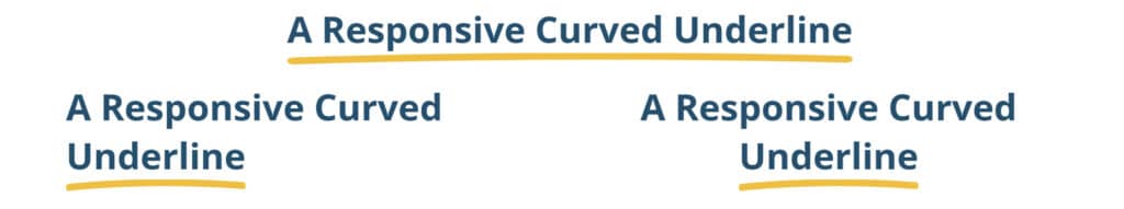
(For context, the yellow underline is an SVG file – not straight CSS.)
While our first thought was to use the SVG as a CSS border-image or as a CSS background-image on a pseudo-element, there wasn’t a way to make its width dynamic based on the width of the text on the last line.
That method would also create a situation where, when the underline was applied to a very long text, the height of the underline would increase in relation to the width – covering a larger area or would get cutoff if a height was defined.
The Solution
The first thing to determine was how to make sure that no matter what the width of the text, the height of the underline remains consistent.
Instead of using the SVG as a CSS border-image or as a CSS background-image, we converted it to a CSS clip-path property. There are a number of online tools that let you do this by simply copy and pasting the SVG markup or uploading the SVG – just make sure that the output for the clip-path property is in percentages and not pixels.
We then added the following CSS:
.curved-underline {
     position: relative;
     padding-bottom: 12px;
     –dgtlnk-curved-width: 100%;
}

.curved-underline::after {
     content: '';
     position: absolute;
     bottom: 0;
     left: 0;
     width:var(–dgtlnk-curved-width);
     height: 12px;
     clip-path: [SVG converted to clip-path];
     background-color: yellow;
}
In the above CSS, we assume that any text that with curved underlines is going to have the .curved-underline class. For the .curved-underline class, we set its position to relative so that the pseudo-element can be positioned absolute relative to the parent, and give it a bottom padding of 12px (which is going to be the height for the curved underline).
We then define the ::after pseudo-element for the .curved-underline class and position it on the bottom of the parent element. For the clip-path, we add the clip path that was generated from the SVG and give it a background color of whatever we want the color for the underline to be. We also define the –dgtlnk-curved-width variable on the parent element and set its initial value to 100%, which we use in the pseudo-element so that the width can be inherited from the parent.
After adding the above CSS, you’ll notice the underline appears under the text, but if the element is a block-level element, it takes up 100% of the width (but takes up the same width as the parent if it is an inline element).
In order to calculate the correct width for the underline, we need to use the Resize Observer API to monitor for changes in the size of the text and use the Range API in the callback function for the Resize Observer to calculate the width of the last line.
// Callback function to find width of last line
function dgtlnkwidthOfLastLine(element) {
     const range = document.createRange();
     range.selectNodeContents(element);
     const rects = range.getClientRects();
     if (rects.length > 0) {
          const lastLineRect = rects[rects.length - 1];
          return lastLineRect.width + 'px';
     }
     return 0;
}

// Resize Observer
const resizeObserver = new ResizeObserver((entries) => {
     for (const entry of entries) {
          entry.target.style.setProperty('–dgtlnk-curved-width', dgtlnkwidthOfLastLine(entry.target))
     }
});

// Yellow Underline Resize Observer
document.querySelectorAll('.curved-underline').forEach( i => resizeObserver.observe( i ));
In the above JS, we define a callback function dgtlnkwidthOfLastLine, which takes a HTML DOM element as a parameter. Inside the function, we create a range object using document.createRange() and assign it to the range variable. Next, we assign the current element’s content to the range object using range.selectNodeContents(element). Then, we use range.getClientRects() to get a list of DOMRect objects, which represent the area of the screen occupied by the range. Last, we calculate the width of the final line and return it as a pixel value.
This is where we use the ResizeObserver interface, whose callback function is triggered when the size of the element with class .curved-underline changes its size (when text wraps to the next line). Inside its callback function, we call the dgtlnkwidthOfLastLine function by passing it the current element to calculate the width of the last line and assign it as a value for the –dgtlnk-curved-width property.
Now when the text wraps to the next line, the curved underline’s width is correctly calculated and updated.
Here you have it: by utilizing CSS properties and variables and Web APIs like ResizeObserver and Range, we’re able to generate responsive, curved underlines whose width is equal to the last line of text.
If you need help with any web development or digital marketing projects, reach out to us.