3 Best Practices for Responsive and Accessible Images

Selecting the right photos and creating the right images for your website is always just a little harder than it seems like it should be.
There’s such a wealth of free stock photography that you can spend days trying to find the right photo (just don’t use these ones, please). And if you have custom photography – which will always increase your website’s impact – then you should be good to go, right?
There are still a number of best practices you need to follow to make sure your photos and images are optimized for all screen sizes and accessible for all users.
Here’s what you need to know.
1. Choose Full Width Hero Images Wisely
Full-width websites – where the content stretches to fill the user’s entire screen, rather than being constrained by a fixed-width container – can be incredibly beautiful and all-encompassing. In this age of responsive design, your website should easily adapt and adjust to whatever device your user has.
Where that can get complicated, however, is when you have a full-width image (perhaps a hero image on your homepage) constantly being stretched beyond its ideal size.
If you’re viewing a full width hero image on a large desktop monitor, and your browser is maximized or even just a little larger than normal, you’re going to see a really large image.
Typically, this issue is handled in one of two ways:
- the hero image is given a fixed height (say, 400px tall), and at larger widths the image is “zoomed in” to fill the space, or
- the height of the hero image gets larger as its width increases, maintaining the image’s aspect ratio
Let’s compare the two options.
On our partner OneCause’s website for their RAISE conference, the homepage hero has a fixed height – so when you make your browser bigger, the image zooms in more.
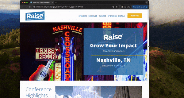
In this situation, when the hero has a fixed height, only choose photos with a focus in the center of the image or with no obvious focus at all. When these images zoom in, it shouldn’t feel like content is getting cut off or you’re losing the meaning of the photo.
When you visit the website for our partner Golden Triangle, their hero images get taller as you make your browser wider – maintaining the aspect ratio and not zooming in at all.
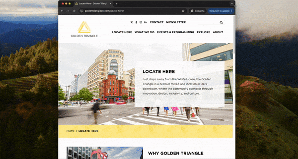
In this situation, choose large, high-resolution photos without a ton of precise detail that could get blurred as the image gets larger. You also need to be prepared that content below the fold will get pushed further down as your image height increases.
2. Don’t Include Text in Your Graphics
As you’re creating promotional graphics to use in your website, resist the urge to add text in the image itself.
Including text in your graphics is a website accessibility no-no, because the text can’t be read by screen readers and other assistive technologies.
Yes, you can (and should) include ALT text in all of your image files, but you will always be better off using live text on top of an image rather than embedding the text in the image itself.
In addition to making it accessible, live text is also able to be crawled by search engines, so you’re also improving your SEO.
This may feel a little limiting to your creative skills, since you will likely be restricted to your website’s font package and your built-in styles, but you will always provide a better experience for your users with live text that can be copied, crawled, and accessed by screen readers.
3. Be Consistent and Use Correct Image Sizes
Building visually-interesting pages where you have flexibility to create a layout based upon your content gives you a lot of power – but with that power comes responsibility.
If your website has layouts or modules that require images to be a specific size, be sure to use that size. Do your editing offline, save for web, and upload.
Your site may or may not do additional cropping or optimizing for you, but don’t rely on it to understand exactly how you want the image to look – it doesn’t do that (yet).
If you’re working in WYSIWYG fields where there’s nothing preventing you from uploading images of any size, follow your brand guide or the precedent set by other site pages and be consistent. Don’t upload a randomly-sized image and then ask why it looks different than the other images on the page – it’s not the right size!
Using the right image sizes is also crucial if your site automatically generates thumbnails of your images for other pages; for example, if the featured image on your blog post gets re-used as a thumbnail on your blog landing page, using the wrong size will lead to a thumbnail inconsistent with the other ones on the page.
Be good about using the correct image sizes, and be consistent where you aren’t forced to use an image of a specific size. Your site will look cleaner and more professional when you do it.
Have questions about using the right images on your site? Reach out and let’s talk about it.

