Using the Resize Observer API to Detect Browser Size Changes
In today’s era of responsive design, we’re constantly thinking about designing for your user’s device and understanding that changing screen sizes directly impacts the layout of your website.
When screen sizes change, we often have to update multiple elements to ensure that both the design stays on brand and that the site functionality continues to work.
One way to make these updates is to use media queries, which allow you to customize your CSS stylesheet depending on a series of breakpoints – pre-defined widths and heights where your layout should change accordingly. These changes can also be made by running a callback function – a function that is passed as an argument to another function – when the browser window width changes.
There are times when neither of these are viable solutions, and in those cases, we can use the Resize Observer API.
Resize Observer, which is one of several Web APIs (like the Intersection Observer API we’ve previously written about), can be used to run a callback function only when the dimension of an element in the DOM changes. Here’s what you need to know.
Initializing a ResizeObserver
In order to initialize the Resize Observer, we use the ResizeObserver interface, passing it a callback function to run when the element being observed changes its dimensions.
const resizeObserver = new ResizeObserver(callback);The ResizeObserver interface provides a few different methods, including the ResizeObserver: observe(). The ResizeObserver: observe() method tells the ResizeObserver interface which element should be observed.
For example, if we have a header with a class .header, we can pass it to the ResizeObserver interface to be observed using:
const header = document.querySelector('header.header');
resizeObserver.observe(header);
After we add the above code, the ResizeObserver interface will watch for any size changes of the header element and run the callback function only when they have changed.
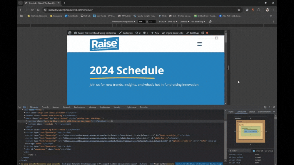
Let’s say that we want to adjust the padding above an absolutely-positioned hero when the header’s height changes. If the hero section has a class of .hero, we can pass the callback function as follows:
const hero = document.querySelector('.hero');
function callback(entries){
    entries.forEach(entry =>
        hero.style.paddingTop = entry.borderBoxSize[0].blockSize
    );
}
In this code, we assign the element with .hero class to the hero variable. Then, in the callback function, we update its top padding with the size of the observer entry (which is the .header element).
By adding just a few lines of code, we can observe the size changes of an element and run functions accordingly. This saves us a ton of time compared to using media queries, where we’d have to determine exactly at what breakpoints the header size changes. Similar to the Intersection Observer API, the Resize Observer API does not run on the main thread – which helps with the website performance.
If you need help implementing the Resize Observer API or for any other digital marketing needs, reach out to us.

