Photo Editing: The Most Interesting Forrest in the World
by Jason Forrest
Insights / Graphic Design /
In order to drive subscriptions to our newsletter, we recently created a new modal overlay encouraging people to sign up. Maybe it just popped up while you were reading, or maybe you saw it on our Facebook page.
We really enjoyed creating it, so we thought it would be fun to quickly show you how we put it together.
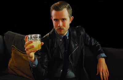
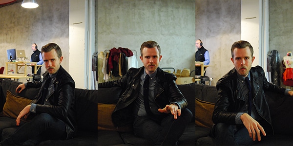
First, as you can see above, I posed like an idiot on the couch in the downstairs lounge area of Indy Hall (where our Philadelphia office is located) while our Staff Designer and photographer extraordinaire Barbara took several shots for us to choose from.
We didn’t want to use the image exactly as is — there’s too much going on in the background, and we really wanted to make sure the focus is where it belongs — on me.
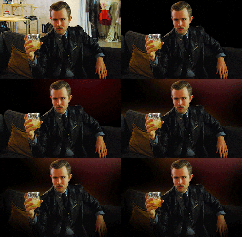
So we brought the image set into Photoshop, and chose the one where I most successfully mimicked the pose of the original actor — the Most Interesting Man in the World, from the Dos Equis commercials. To be honest, given my acting skills, there were not many to choose from.
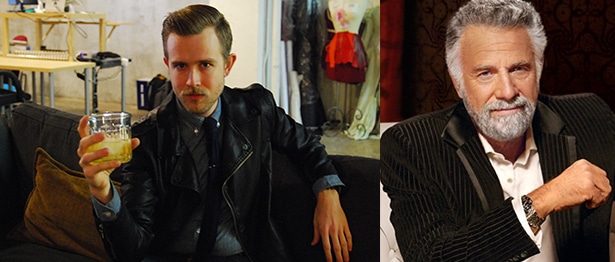
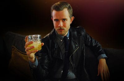
Clearly, the Most Interesting Man in the World never hung out in a coworking space full of desks and clothing samples. So we used the quick mask tool and a Wacom tablet to apply a layer mask. Combined with a black fill layer under that, voilà! We have the beginnings of a nightclub scene.
But the picture was still missing something. So we added some simple lighting effects, using the radial gradient tool and the brush tool, with the hardness level set to 0% (to give the lighting more of a bleeding effect).
We chose the colors we did to accentuate the blue in the shirt I’m wearing and the orange/tan of the couch pillow. Night club colors, and the colors in the original ad, also tend to be warmer.
We could have stopped here, but there was a small thing that still needed touching up. Because we are respectable, hard working folk, we don’t make a habit of drinking whiskey during a work day.
So to make this shot look like a night club scene, we had to improvise. In the photo, I’m actually holding sparkling apple juice with ice cubes. But since apple juice doesn’t have the same caramel coloring that whiskey does, we had to darken the coloring of the liquid to make it look more like the real thing.
We used the quick mask tool again, combined with a color balance and levels adjustment layer. And with that we had our finished product!
We had a blast putting this together, and would love to help you with your next photo editing project or ad campaign. Give us a shout today.
