Modal Windows Can Work, But Do Them Right
by Jason Unger, Founder
Insights / Website Design /

Pop-ups.
There’s not a technology on the web that is more hated than the dreaded pop-up. No one likes them. Literally.
Pop-up ads became popular in the late ’90s and early 2000s as a way to ensure advertisements would be seen by users, especially as it became apparent that banner blindness was indeed real. They quickly became hated — nearly 95% of users have negative or very negative responses to them — and nearly every browser implemented pop-up blockers to prevent them from being displayed.
Over the years, they’ve been associated with computer malware and junk software, making users even less likely to trust what they see.
But while pop-up ads tended to be displayed in a new browser window, current “pop-ups” are more often done in the same browser window, often using jQuery to interrupt the user experience. Since they’re not popping up a new window, these are more often referred to as “modal windows.”
Traditionally, a modal window has been used in software when user input is needed to take the next step in the journey. For example – as eloquently outlined in this StackExchange post – when you’re in Microsoft Word and open a file, you’re given a modal window to choose the file. Or, if you’re trying to access a password protected area, you may see a modal window to enter the password.
While “modal” technically refers to the procedure or logic of the action, the modal window online has become known more for the style – and not the substance.
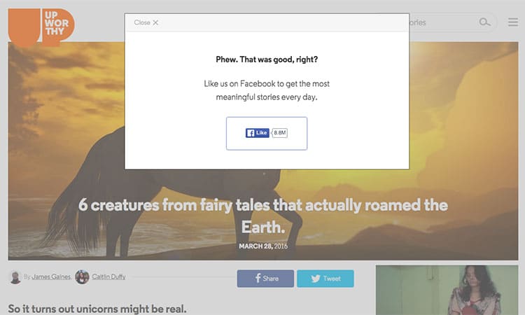
Everyone’s seen the modals on sites like Upworthy that ask you to share the post you’re viewing, or click “I agree / I disagree” on a statement presented to you when visiting the site. Many sites use modal windows to encourage people to subscribe to their newsletter, like them on social media, or take some other action.
I certainly applaud telling users what you want them to do, but too often, modal windows aren’t done with users in mind.
Here’s how you can make your modal windows effective.
Don’t Open Them Right Away
I’ve seen so many sites that load the modal window the second a new user lands on a page.
Don’t do that. It’s annoying.
The user has barely had time to figure out the layout of your site, and where they need to go to find the information they want — and now you’re interrupting their process? Just don’t.
Wait to show your modal window. Don’t display it right away. Not only will you not annoy the user, but if they’ve stayed on the site, then they’re more likely to be interested in what you’re offering.
Better yet, don’t show the modal until they take some other kind of action. Maybe it’s scrolling to the bottom of your page, watching a video or clicking to a second page. Let them show their interest before you start trying to sell them on what you offer.
Don’t Show Them on Mobile
It’s so annoying to load a website on your phone only to find that the entire screen is covered by a modal window asking you to sign up for a newsletter.
Don’t do it. Disable your modal windows on mobile.
Not only is the visual annoying, but more often than not, the action you’re asking the user to take requires either typing (“enter your email address”) or opening another window (“like us on Facebook”).
Mobility is all about ease of use and finding the information you need now; don’t make it harder than it needs to be.
Don’t Make it Difficult to Close
Unfortunately, we’re all used to getting hit with annoying sales pitches online, especially through modal windows. But there’s nothing more annoying than not being able to close the window immediately.
If a user is willing to deal with the interruption caused by a modal window and still wants to view what’s on your site, consider yourself lucky; they really must want to find something.
So don’t make them wait 25 seconds until your video finishes, or hide the close button in the bottom left corner of the window, or use some kind of overlay so that the close button needs to be clicked in one exact spot to work.
It’s annoying, and makes users not want to come back to your site.
No amount of advertising or promotion is worth annoying your users that much, so don’t do it.
Modal Windows Can Work
If you want to use a modal window, give it a shot – it could prove beneficial. We do on our site to drive newsletter subscribers, with a great picture of Forrest as The Most Interesting Man in the World.
But use common sense and think about how you’d like the experience to be. Would you like to be annoyed while you’re trying to surf the web? Or would you like to get a legitimate, valuable offer when you’ve shown interest in something?
Be kind and considerate. It’ll come back to you.
PS. If you’re looking for plugin to use with WordPress, we recommend Modal Dialog.


