When to Use a Microsite: Examples and Benefits

Maybe you’ve heard the word “microsite” thrown around before – but what exactly is it?
A microsite is a website that exists independent of your primary site, created with a specific goal in mind. They typically have fewer pages than a full website and are focused on a product, service, or other information that doesn’t fit with your main brand or site content.
Microsites serve an important role in web design, whether it be helping brands reach shorter-term goals, targeting a specific audience, or simply showcasing information in a unique way.
So, when should you use a microsite? Here are four great examples:
1. Journalistic Mini-Series

Via New York Times
The mini-series microsite has grown in popularity, perhaps inspired by an increased interest in podcasts and investigative journalism.
This New York Times six-part series describes an avalanche in Washington’s Cascades (2012) in detail, including interviews with survivors. By featuring the story on a stand-alone microsite, New York Times immerses users in a visually-interesting digital experience, enabling readers to navigate between story parts, view a map of the area, and learn about the group.
It also allows the series to incorporate different layouts and styles as well as utilize dynamic effects like parallax scrolling. It’s an impactful way to tell a story that wouldn’t be possible if it were featured on the main New York Times website.
2. Informational Reports

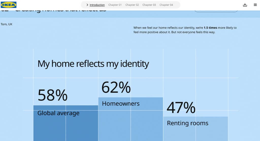
Via Ikea
Microsites are an excellent tool for presenting information that is usually stale or static, such as annual reports or research. Ikea’s annual research project, “Life At Home,” takes an empathetic approach to understanding what people are thinking, doing, and feeling at home.
By using statistics, pull quotes, and infographics to present the information, Ikea is able to present their findings in an interactive and engaging way. Their focus on understanding customers and improving life at home establishes an emotional connection and serves to build brand loyalty.
3. Large-Scale Events
An event microsite provides a hub for people looking for specialized information relating to the event.
Jewish Federation of Greater Philadelphia’s Israel 75 microsite showcases a variety of upcoming community events, volunteer opportunities, FAQs, and more all relating to Israel’s 75th birthday.
Using a standalone microsite allows for a little more creative freedom and establishes unique event branding, while providing a clear, centralized source of information for event-goers.
4. Outreach or Campaigns

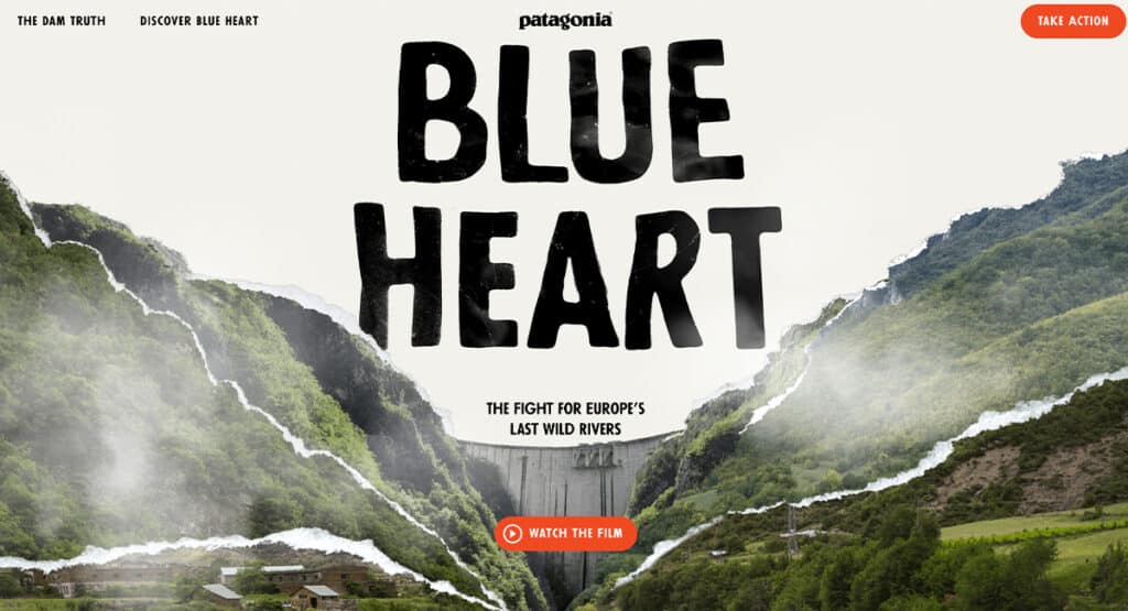
Via Patagonia
Sometimes it makes sense to create a microsite when the scope of a project doesn’t fit into your main site.
While Patagonia is recognized as a leader and proponent of environmental conservation, their main site is focused on e-commerce. This Blue Heart microsite is set up as an interactive experience to learn more about Europe’s wild rivers and the efforts to save them, with a clear call to action.
Since the goals align with Patagonia’s existing brand, the microsite strengthens their brand presence while also reaching new audiences.
A microsite can be a fun way to experiment and connect with new audiences. Before you begin, establish a clear objective for the site and understand your end goals. If you have a goal in mind that could benefit from a microsite, reach out to us.


