Logo Design 101: The Basics You Should Know
by Gina Armstrong, Lead Designer
Insights / Graphic Design /

Your logo is arguably one of the most important elements of your brand identity.
It is a visual representation of your brand, designed to communicate so much about your organization in just a split second.
We’ve previously discussed what makes a good logo conceptually, some iconic logos, and even outlined Airbnb’s controversial logo redesign.
Before you jump into the creative process, there are some basics you should understand.
Types of Logos
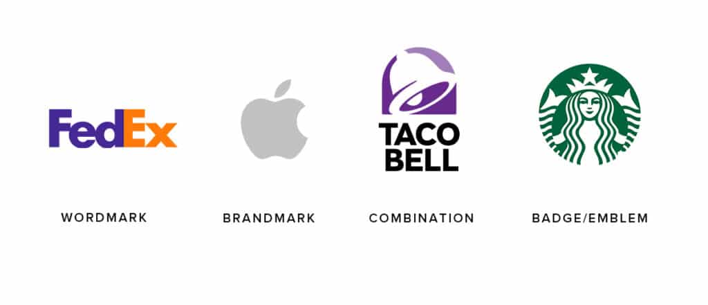
There are several different types of logos. Here are the four basic categories:
- Wordmark: Logo comprised of stylized text (ex: FedEx)
- Brandmark: Logo is an icon or graphic element (ex: Apple)
- Combination: Logo utilizes both text and graphic elements (ex: Taco Bell)
- Badge/Emblem: Logo with text and/or graphic elements within a badge (ex: Starbucks)

The type of logo you create will depend on your brand, but typically a combination logo works best because it provides versatility – you can break apart the elements and use them separately or use the full logo for full impact.
Regardless of the style, it’s important to keep in mind that a logo should be legible at small sizes, which means keeping intricate details, text, and taglines to a minimum.
File Formats
Depending on the medium, you’ll need to utilize different file formats. Since color is handled differently for print and digital files, graphics won’t appear correctly if the wrong format is used.
Here is a quick breakdown of the most commonly used logo formats for each setting.
Digital
- PNG (provides a transparent background)
- SVG (scalable)
- JPG (if high quality)
- EPS (scalable, often used in large format printing)
Tip: If you’re having something printed it’s always best to speak with your printer and find out any specific file requirements.
A complete logo library should include formats that will work for both print and digital – you cannot rely on one JPG to do everything! Ideally, it should include a vector file of your logo (either as an SVG or AI) since these are scalable and provide the most flexibility.
Colors
A good logo should be effective in black and white, and many designers will work without color until the final design has been selected.
Once color is added, it’s best to stick to 2-3 solid colors – the more simple you keep the color scheme, the better it will work in a variety of settings. When all is said and done, a full logo library should include a full color version, a black version, and a reversed (or white) version.
A good logo design will be easily recognizable, legible, and work at a variety of sizes and colors (even if it doesn’t have any hidden messages in it). With any logo, it’s important to outline appropriate use (as well as how not to use) in a comprehensive brand guide. This will ensure consistency and help prevent the brand from becoming distorted over time.
Working on a new logo and have questions? Reach out to us – we can help.


