These 404 Error Pages Are Legendary
by Gina Armstrong, Lead Designer
Insights / Website Design /

Photo by Ayla Verschueren via Unsplash
We’ve all been there before — you clicked on a link or typed in a URL, and suddenly you’re faced with “404 – Page Not Found.”
The error message means that either the link is broken, it never existed, or contains a typo.
These situations can definitely annoy the user, but one way to combat that frustration is by creating a unique 404 page.
Designing a 404 Page
There are many directions you can take when setting up a creative 404 page: mini-games, interactive tools, humorous images, and helpful links are just a few examples. The goal is to design a page that encourages users to continue engaging with the site, and not bouncing away.
Regardless of which route you take, it’s important to be sure both your imagery and copy are on brand, and that you provide a path to alternative pages.
Check out these five examples of unique and effective 404 pages:
1) Figma
Figma is a vector graphics editor and prototyping tool used for website design.
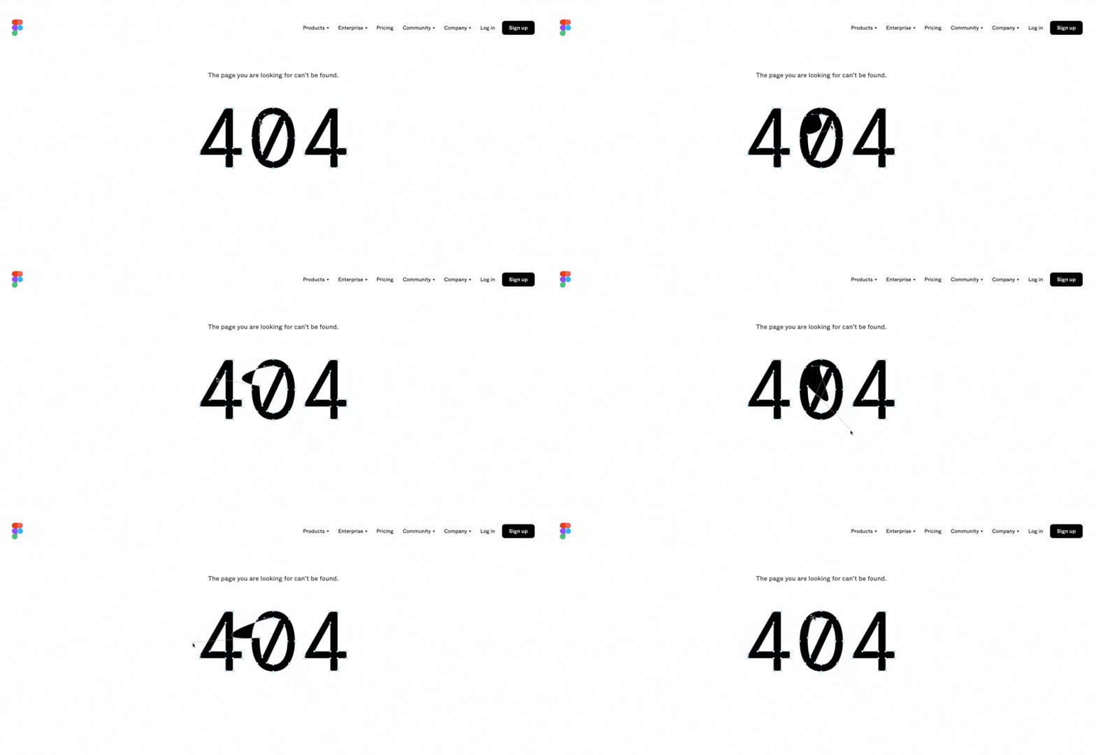
As a design software, it is very on-brand that the 404 page is structured as an interactive design tool.
Here, you can play with the vector points on the text, changing the shape and size of the ‘404’. It’s engaging, which helps alleviate the frustration of having landed on a broken page. The page also features the menu navigation and extensive footer, so they can easily click back to the homepage.
2) Unsplash
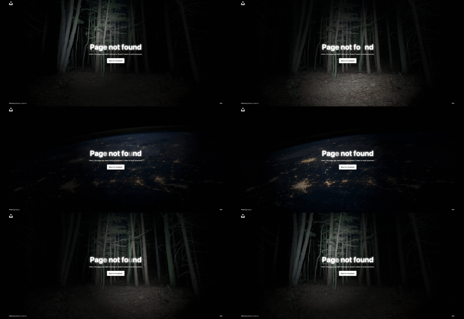
Unsplash boasts another excellent example of a thoughtful and on-brand 404 page choice. A royalty-free photography site, Unsplash’s 404 page features user-generated photos.
They’ve also layered a spooky element where your cursor functions as a flashlight, illuminating only small parts of the photo at a time. The page is otherwise minimalist, with credit to the photographer and one button providing a route back to the homepage.
3) Dribble
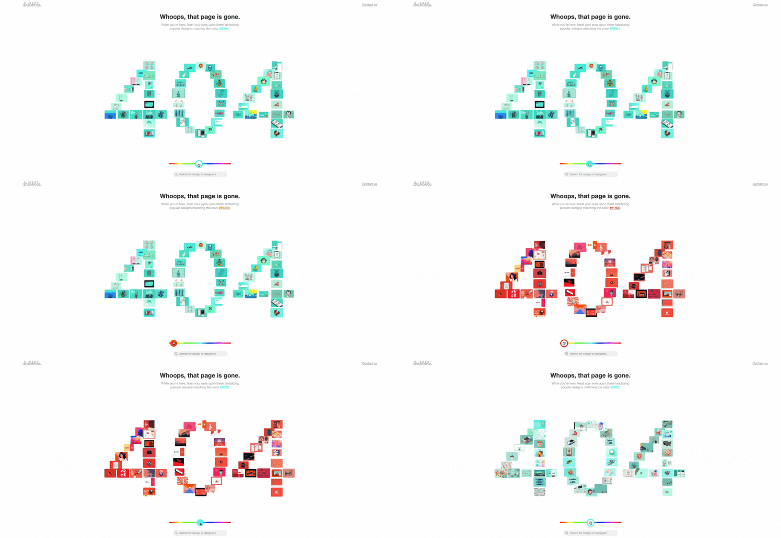
Dribble is a portfolio website for designers, with a colorful 404 page. The page features popular designs in every color of the rainbow. You can adjust the color slider to see a new set of featured designs, and click any of the designs to get a closer look.
This is a fantastic, interactive solution to encourage users to remain on the site.
They also offer a useful range of helpful options to the user including a link back to the homepage, a contact button, and search bar.
4) Discord
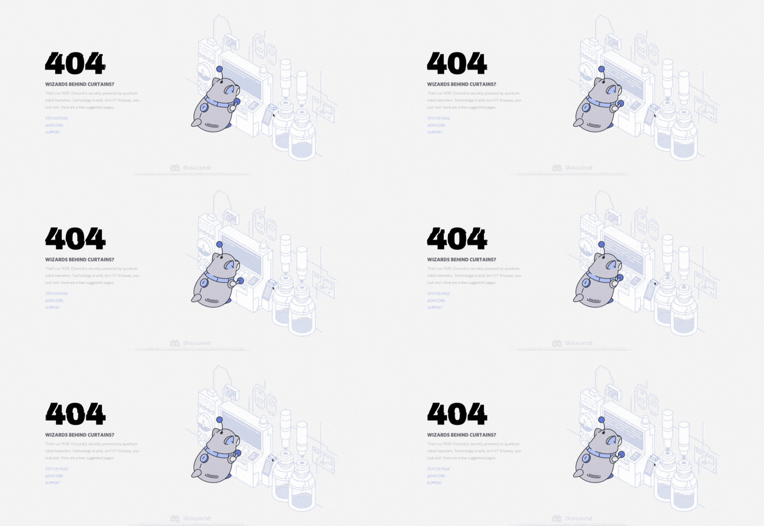
This one is fun. Discord is a free voice, video, and text chat app with an excellent 404 page. At first glance, you’ve arrived on a static page, with links for getting help. However, there is a fun little easter egg if you can find it! An overlay then pops up with a retro Snake game that you can play.
With an amusing gif, humorous caption, Wizard of Oz throwback, and mini-game, the creativity is off the charts. Plus, who doesn’t love Snake?
5) ASPCA
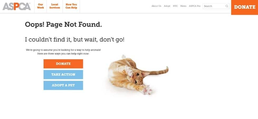
In this last example, American Society for the Prevention of Cruelty to Animals (ASPCA) demonstrates a more straightforward 404 page solution.
With a cute photo of a cat reaching towards you and brand-specific copy, you’re encouraged to help in one of three ways; donate, take action, or adopt a pet.
The main menu navigation is also still accessible, should you wish to explore other pages.
Get Creative
Hopefully these examples will inspire you to ditch that boring 404 page (or re-direct to the homepage, which is confusing and frustrating for users) and create something truly unique.
Regardless of your brand or industry, everyone’s goal is for users to have straightforward navigation and an overall positive experience on your website. And hey, if you need one more example, you can always check out our own 404 page.
