Designing for Large Format Printing: Billboards, Banners + Posters

Creating a file for print — as opposed to digital — requires some technical knowledge in order to ensure that the end product is high quality and meets all print requirements.
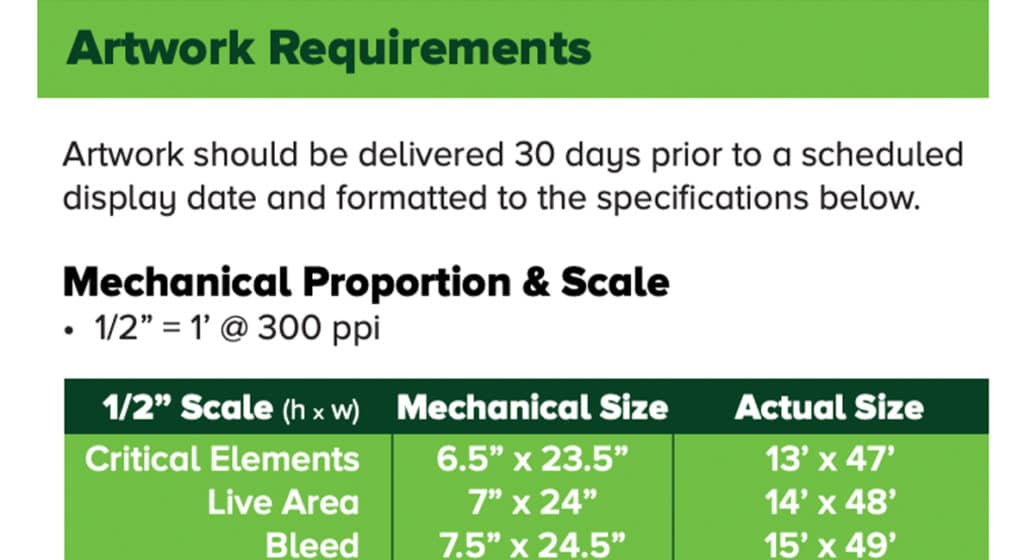
These particulars become even more important when you are designing something for large format printing, such as a billboard, banner, or signage for events. Since print specifications vary depending on the printer, print material, and size, your print vendor should provide a document that clearly lists the specific details for you.
When creating a file for large format printing, here are 5 major tips to keep in mind:
1. Make sure you’re working in the correct color space
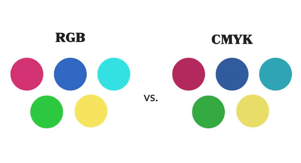
For any print project, you need to be working in the CMYK color space, rather than RGB. Some printers may request that you provide Pantone colors for an even more precise color match. CMYK is the breakdown of Cyan Magenta Yellow and Black that formulate different colors on paper.
Since colors appear brighter and more vibrant on screen than they do when printed, it’s important to use a brand’s established color formulas rather than relying on the appearance on your monitor.
2. Use vector graphics, when possible
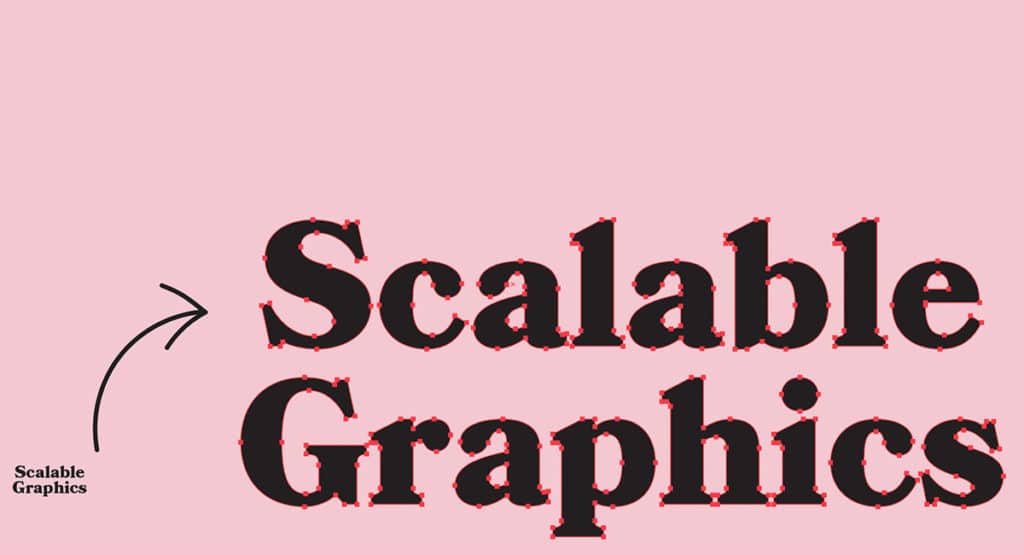
When creating your project, work in a program like Adobe Illustrator or InDesign that supports vector graphics. Elements such as the logo, typography, and any other graphics in your design should be vector-based. This is because vector image file types are scalable — so they can stretch to any size without degrading the quality of the graphic or becoming pixelated like a photo would.
Remember, if you are incorporating photos, they need to be high resolution. Check that they meet the minimum resolution established by the printer when printed at project size.
3. Work at scale
You’ll likely be asked to provide files that are scaled down – which allows file sizes to remain smaller. This just means taking the final project measurements and dividing by a certain number.
For example, say you’re designing a billboard that’s going to be 192 inches by 60 inches and you’re working at 1/4 scale — the design document will be 48 inches by 15 inches.
Take note of whether you need to include a bleed, and don’t forget to include that number when making your calculations. The bleed is a small area outside of the trim lines. If you want your artwork to extend to the edge of the page, rather than including a white border, a bleed can help you accomplish just that.
4. Keep it simple

Via MD Energy Choice
Consider the way your audience will be interacting with the final product. Is this a billboard on the highway? If so, you want to keep the text very minimal — probably just a short tagline and website URL.
People driving by won’t have much time to absorb information, so you want to only include the most important details.
Make sure to use imagery and color to establish the mood and help bolster the messaging. If you’re designing something that will be viewed by pedestrians, like a poster or event signage, you should consider including a QR code so that people can easily access additional information.
5. Export settings
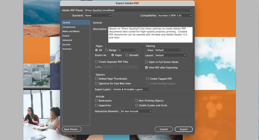
When you export your file, make sure your settings meet the specs established by your printer. This is also a good opportunity to double-check that your size calculations and bleed are correct. Lastly, outline the typography and package your file so that the printer has access to all the components of your design if something isn’t displaying correctly.
If you run into issues while designing your file for large format printing, remember that the print vendor is well-versed in these specifications and should be able to answer any questions you have about the process.
And of course, if you need help creating a large format design, don’t hesitate to reach out to us.
