Personalize Your Website: 4 Interactive Features to Set You Apart

Implementing interactive features on your website can create energy, engage your users, and help establish a positive impression of your overall brand.
Typically, it’s best to stick to microinteractions that enhance the overall impression of the site without making the experience feel cumbersome or overwhelming. Well-executed interactivity creates a custom feel without interrupting the user experience.
If you need some inspiration, take a look at these four interactive elements that can help make your website standout.
Animation & Hover Effects

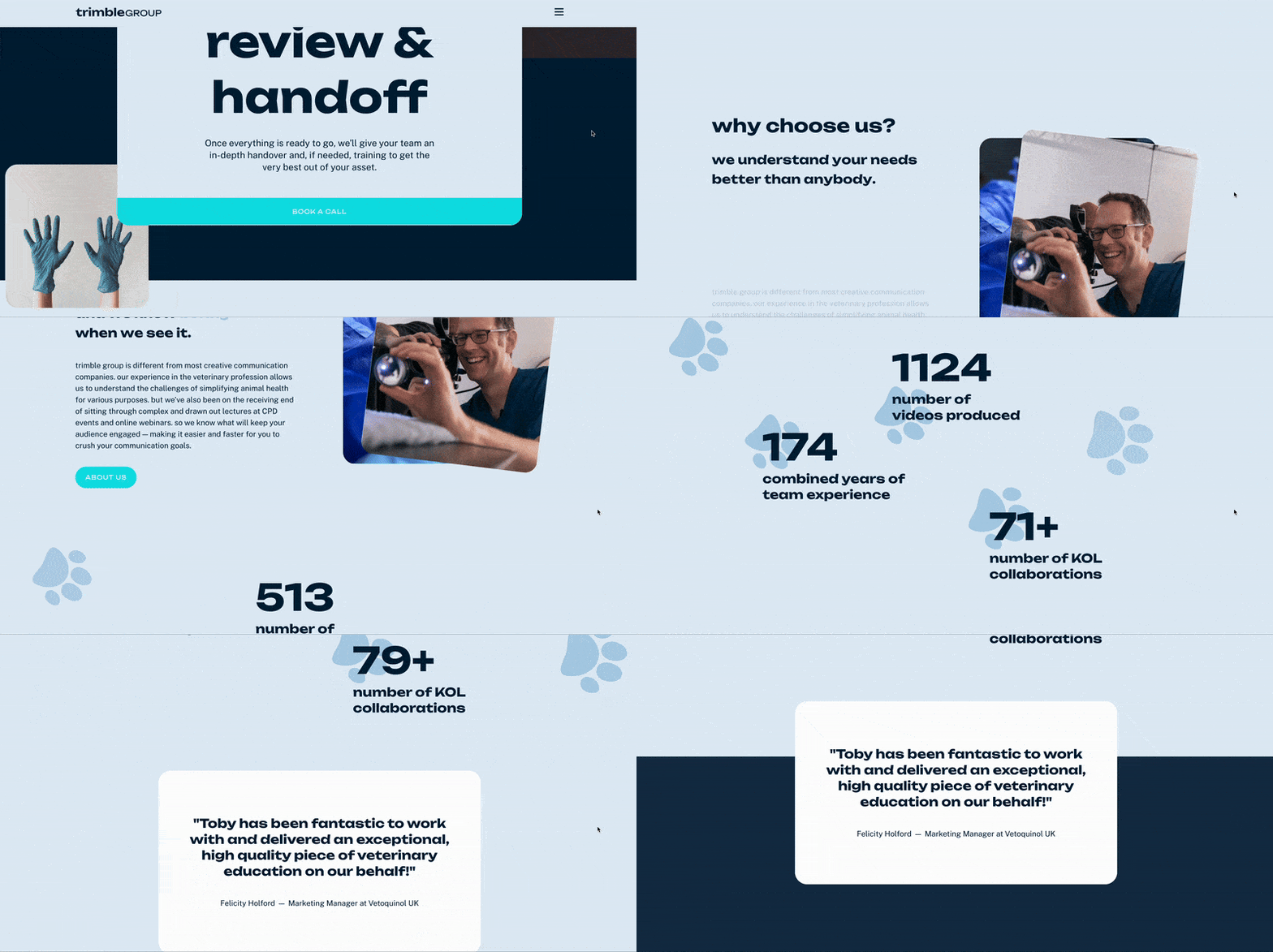
Source: https://www.trimblegroup.io/
Animation, like design elements that grow or slide into place as you scroll and statistics that count up to their final total, can help engage users and bring an otherwise static site to life.
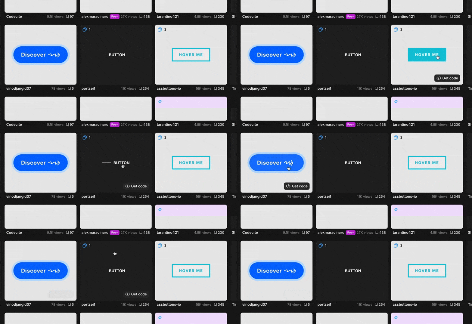
Similarly, using hover effects on buttons, links, and images adds a level interactivity to a relatively simple user experience. There are lots of opportunities for creativity here; for example, buttons don’t have to just change colors – you can incorporate arrows, gradients, and more.
Thinking outside the box here will help to set you apart from competitors.
Animated Cursors
Ranging from simple to over-the-top, an animated cursor is a playful interaction that creates a customized feel to your site.
They’re best used sparingly, however – when overdone, it can make the page feel clunky and quickly becomes detrimental to your user’s experience. You should carefully consider whether your brand is a good fit for this type of interactivity on your site.
Quizzes

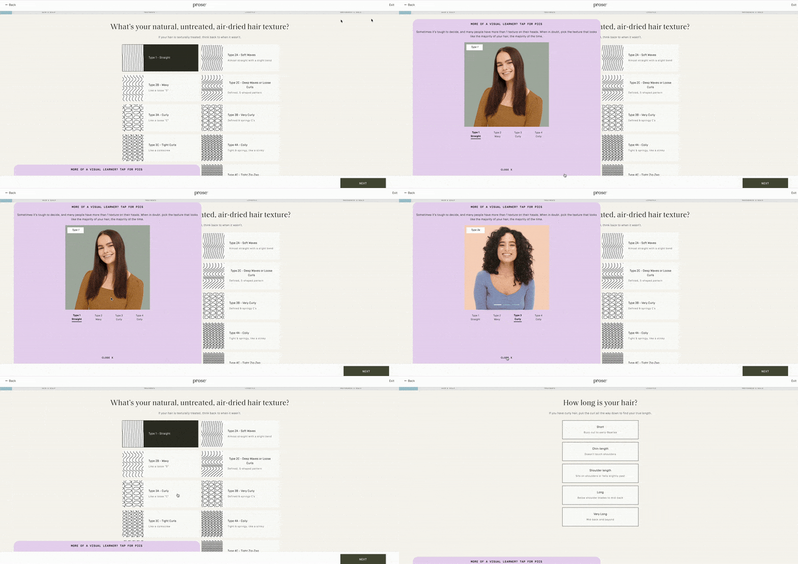
Source: https://prose.com/consultation
Quizzes are a great way to engage an audience. They gamify an otherwise ordinary interaction and make for a customized experience.
In this example, users can take a quiz that helps them select the hair product that best fits their needs. You’ll also notice the use of a progress bar at the top of the page – which gives users an indication of how long the process will take.
This kind of transparency not only makes for a more enjoyable user experience, it’s key for building trust.
404 Page

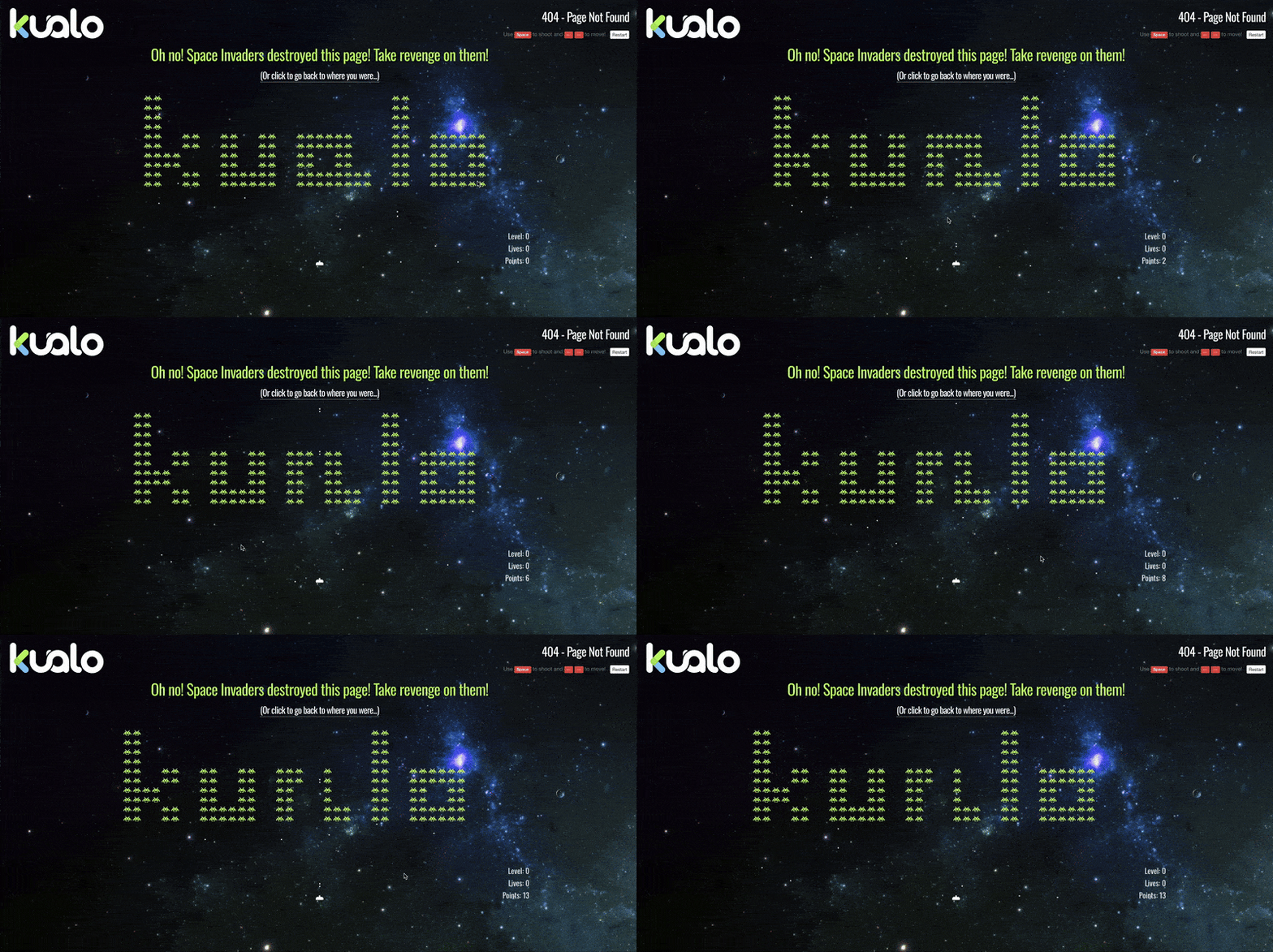
Source: https://www.kualo.co.uk/404
Although 404 pages are (hopefully) rarely interacted with, having a custom one is a nice touch. You can have fun injecting interactivity, even implementing mini-games and encouraging users to have a positive, engaging experience with your site.
Most importantly, make sure your 404 page includes a search option and/or a pathway to alternative pages.
As you explore various features to try on your own site, remember that a site’s functionality is crucial for creating delight and getting return users. If you need help brainstorming, you can reach out to us.


