3 Inspirational Brand Guidelines to Elevate Your Identity
by Jessica Wentworth, Graphic Designer
Insights / Graphic Design /

Photo by Theme Photos on Unsplash
It is essential for every brand to have clear and concise brand guidelines to help establish a unique and consistent identity.
Brand guidelines are like the rulebook for your brand. They outline all of the essential elements of your branding and how to use them – everything from application to messaging and everything in between.
Oftentimes, drawing inspiration from famous brands can offer valuable lessons for your own strategy.
Let’s dive into three examples of strong brand guidelines and take a look at some key takeaways that you can apply to elevate your own brand.
Starbucks
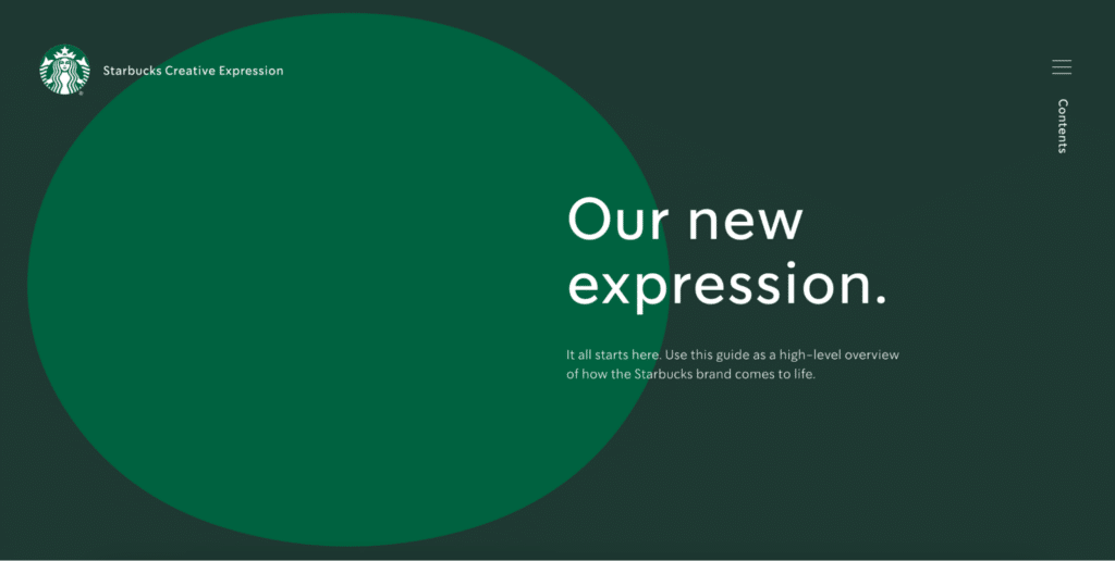
Iconic coffee brand Starbucks sets the bar with an interactive version of their brand guidelines. Not only is this example full of creativity, but it is also clear and easy to navigate.
These guidelines go beyond the basic fonts and colors. They prioritize visual consistency across the board, offering details on the usage of their illustrations and imagery. It even includes case studies of some of their brand initiatives, providing a deeper understanding of their branding theory in action.
Starbucks teaches us how a user-friendly brand guide makes it easier to stick to branding standards to keep your brand strong and cohesive. Their approach serves as a great example to make sure every piece of your brand works together seamlessly.
Asana
Asana is a popular project management platform. Their brand guidelines are a great example for any business who prefers a simple and straightforward style guide.
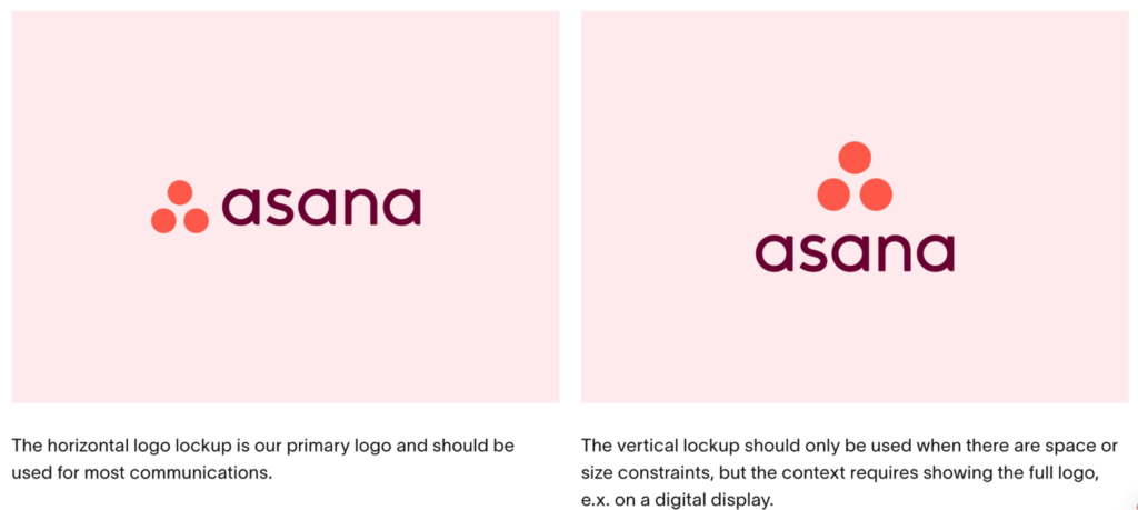
While their guidelines are brief, they are also effective. The guide clearly outlines how to use their brand assets, offers directions for application and co-branding, and even addresses common branding mistakes with tips on how to avoid them.
Asana teaches us that a concise guide with clear usage instructions is still effective in ensuring brand consistency and preventing errors.
Mailchimp
Mailchimp knows that building a strong identity goes beyond just visuals. Their brand guidelines not only showcase their unique personality, but also include extensive guidelines on maintaining a consistent voice and tone.
Your voice and tone shapes how your brand connects and communicates with your audience. By including this in their brand guidelines, Mailchimp is able to build more trust and recognition. As a brand that prioritizes communication, this allows their messaging to be cohesive and impactful across the board.
Mailchimp teaches us that effective brand guidelines are about more than just your logo — it’s also important to include additional sections necessary to help shape your overall brand identity.
If you need help crafting or refining your brand guidelines, reach out to us — we’re here to help you build a brand that stands out and connects with your audience.


