Increase Your Website’s Impact: Try These 3 Design Elements
by Gina Armstrong, Lead Designer
Insights / Website Design /

Photo by Jimmy Chang on Unsplash
Your organization is more than just the services your provide, and your website should reflect that.
That’s why we emphasize telling your story – because sharing your “why” fosters a connection with your audience. If you’re able to create a narrative that establishes a strong connection, you’ll effectively share your impact, improve engagement, and have a greater chance of reaching your goals.
In order to create an impactful website, here are three visual elements we like to utilize.
Statistics

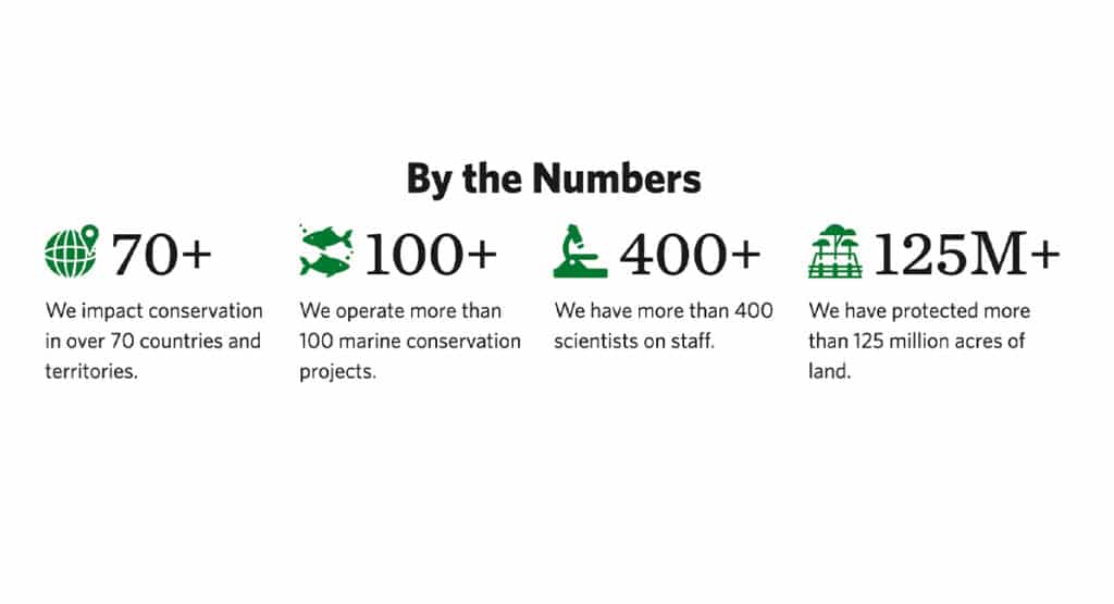
Screenshot from Nature.org
Statistics are a great way to share concrete evidence of your organization’s impact.
Figures are broken down into simple terms, where viewers can scan the area and quickly gain an understanding of your reach. The use of large text, icons, and graphics help illustrate your impact, while also introducing design elements that help break up heavier content on the page.
Depending on the nature of these stats, you may have the opportunity to incorporate some interactivity as well.
Social Proof

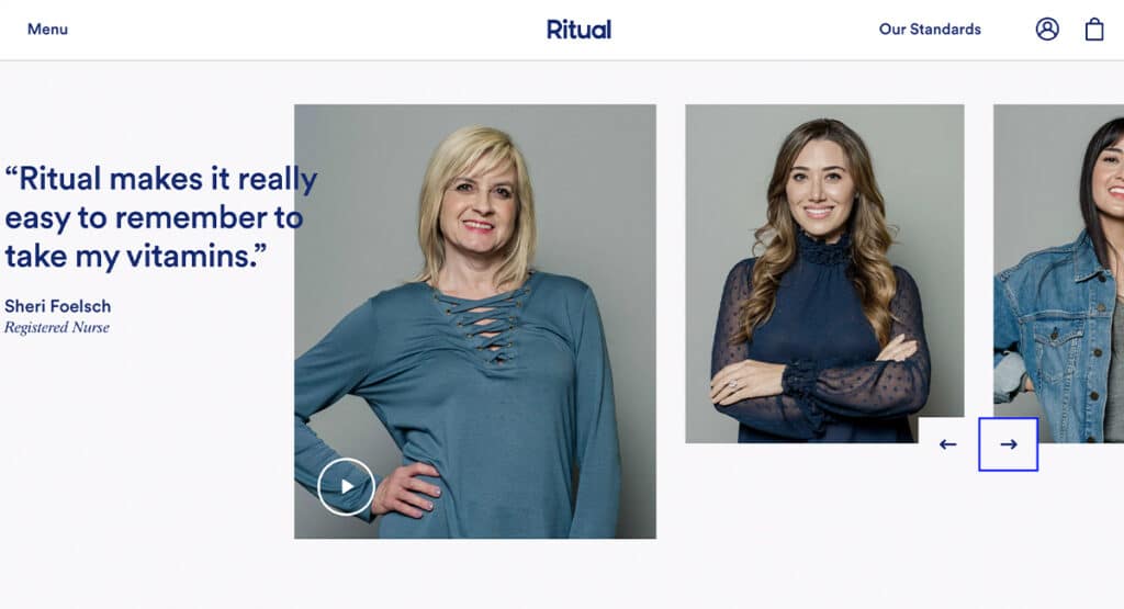
Screenshot from Ritual.com
A section with social proof, such as customer testimonials, case studies, or partner logos, is particularly impactful because it helps to gain the trust of your audience.
Sharing positive feedback is proof of a successful relationship, and gives the user a better understanding of what it will be like to engage with your organization. It also provides a break from regular content with an opportunity to get creative with colors, imagery, and other graphic elements.
Custom Photography

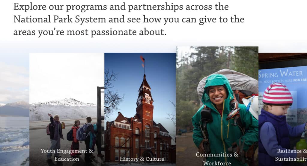
Screenshot from NationalParks.org
One of the most impactful things you can do for your site is to create and use custom photography.
While stock images have their place, and can certainly be powerful, we prefer to use them as a way to “fill in the gaps” instead of being the main focus. That’s because with stock images, you have no control of whether other organizations use them – and having the same imagery as others can make your site feel stale and unoriginal.
Images from team get-togethers, fundraisers, or other in-the-field events add a personal touch to your site. They humanize your organization, reminding the viewer that there are real people behind the work being done. This can be particularly effective on a call to action, which often depends on an emotional connection with the user.
A website’s design isn’t one-size-fits-all. It should tell your story in a unique and compelling way that encourages your users to engage further.
By incorporating these elements, you’ll create a site that is not only visually interesting, but impactful as well. If you need help with your vision, reach out to us!


