5 Mistakes You Might Be Making On Your Homepage

Your website’s homepage is arguably the most important page you’ll create.
After all, first impressions matter – and your homepage is where visitors will quickly decide whether they want to remain on your site or close the tab (for good).
A well-designed homepage establishes your brand’s voice and mission, welcomes new users, and guides them to take further action. On the other hand, a poorly designed page will drive people away.
Here are 5 common mistakes to avoid when designing your homepage.
Don’t: Assume the user already knows who you are

Photo by Startup Stock Photos via Pexels
One common pitfall is focusing too heavily on content, and not enough on introducing your organization.
When you assume that visitors are already familiar with you – and you do things like use organization-specific terminology or fill the page with current news/events – you end up alienating new users.
Instead, think of your homepage as a high-level overview of “who”, “what”, and “why”. There should be an emphasis on telling your unique story, highlighting what sets you apart and why your user should care.
Don’t: Try to cram in too much information

Photo by Pixabay via Pexels
Trying to include too much information on your homepage will only overwhelm visitors.
Rather than attempting to squeeze in paragraphs of text, think of your homepage as an elevator pitch for your organization. Each section should include only a few sentences as a brief overview of that area of content (with a link to internal pages to read more).
There should be a healthy amount of white space, imagery, and other visually-interesting elements to break apart the text. Remember that if the information isn’t scannable and easily digestible, you risk losing your audience’s attention.
Don’t: Disregard User Experience

Photo by Pixabay via Pexels
In order to engage your audience, it’s essential to consider usability.
Your homepage should be thoughtfully laid out, with content organized in a way that makes sense based on that audience. For example, if you know what pages are frequently visited, make sure those pages are easy to find.
You’ll also want to ensure the page is mobile-friendly. There’s nothing more annoying than not being able to view a website because it wasn’t built responsively.
Don’t: Ignore accessibility
Some sites may be more accessibility-focused than others, but regardless of your target audience, it’s important to regularly follow a few basic guidelines:
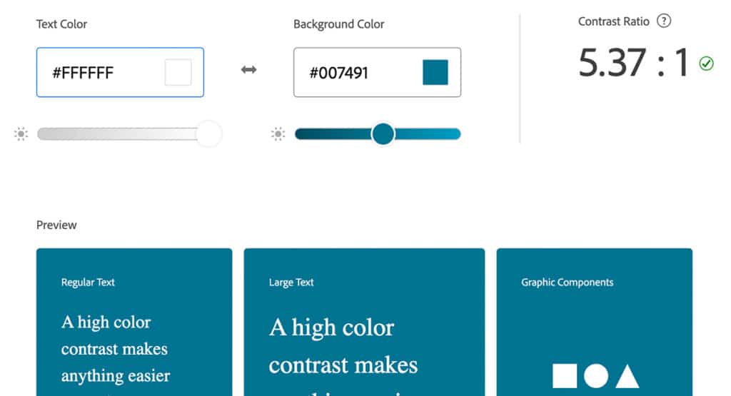
- Color contrast: Make sure that the color contrast of any text is high enough (A minimum contrast ratio of 4.5:1 is recommended for body text. You can check yours here).
- Font choices: Body text should be sans-serif to ensure legibility. More tips on selecting the right typefaces can be found here.
- Hierarchy: Establish visual hierarchy to make the page scannable and easy to understand; Headlines, body text, and buttons should all be easily distinguished.
- Alt text: Including alt text for images improves SEO and provides crucial information for people who are vision-impaired.
While having an accessibility widget is a good start, go beyond the widget and ensure your pages are completely accessible. (Test out your site with these accessibility tools.)
Don’t: Forget about the CTA
Be sure you have an end-goal in mind. When a user reaches the end of a page, they should be prompted to take an action through a ‘Call To Action’ (CTA).
If a viewer reaches the bottom of a page and hasn’t yet found what they’re looking, the CTA can serve as a way to catch them before they exit your site.
A homepage should be a compelling and succinct introduction to your organization that guides users to engage further. If you’re struggling with any of the mistakes mentioned above, we’re here to help! Reach out to us.


