The Hero Image: With Great Power Comes Great Responsibility
by Jason Forrest
Insights / Website Design /

Your website isn’t just viewed on desktops and laptops any more; in fact, you may be getting more mobile visitors than desktop traffic.
That’s why responsive design — the ability to shift the layout of your site depending on the device it’s being viewed on — has long been our standard practice, and weighs in Google’s ranking of your site.
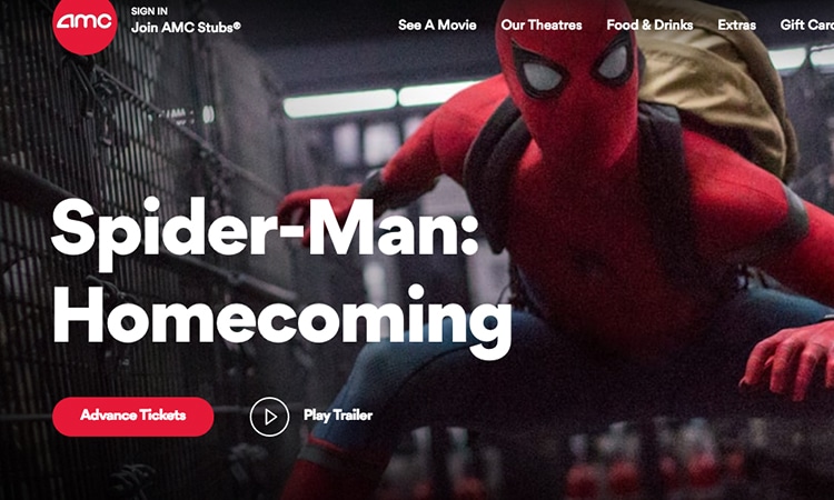
As more people view your website on devices with varying screen sizes, compelling imagery has begun to take priority over wordiness in design. In many websites, you’ll immediately see a large photo or image that sets the tone for your experience.
This is the hero image.
A hero image is the primary image you see when you first visit a site, and it visually reinforces the brand story and sets the stage for the rest of the user experience on the site.
Creating a great hero image is crucial to the success of your site. Here’s how to do it.
Choose the Right Image
The best hero image starts with the highest resolution image possible.
If the first thing someone sees when they go to your site is a blurry, pixelated photo, they’re going to leave. Your image should be high-res, clean and clear. This is even more important now that most devices come equipped with ultra high resolution displays.
The hero image should effectively convey your brand story.
What emotion do you want a visitor to your site to feel? Should they feel inspired to donate to your non-profit? Should they be so floored by the coolness of your brand that they feel compelled to look at your products?
To convey your brand story effectively, choose an image that works with your brand colors and typography.
The right hero image has to work at multiple sizes.
You can’t design only for the desktop. You have to consider what will happen to the image when it’s viewed on a phone or tablet.
Be sure to see how the hero image is cropped in relation to the elements around it. Does it still have the same meaning that you intended? You may want to consider creating multiple versions of the hero image by cropping it for different break points, or you may consider removing the image entirely for some devices.
Sometimes, the right hero image is an illustration or a video.
If you’ve searched through every photo on sites like unsplash.com and nothing seems to fit the look that you’re going for, you should consider an illustration. This will give you more control over the subject matter and positioning of the hero image.
It may also add another level of fun or excitement to the branding of your site.
A video can often be more engaging than a static photo, but it can also be distracting from messaging and call to actions, so if you use one, be careful how you use it.
Make the Text Readable
Most hero images have text overlaid on the actual image, so maintaining a high contrast helps ensure that text remains readable.
There are several ways to achieve high contrast:
- Font style: To be readable, your font often needs to be simple and bold. However, if your branding requires a thin, elegant typeface, and it’s easy to read, go for it.
- Opacity overlay: Adding a semi-transparent layer of dark color between the text and image creates visual separation and increases clarity.
- Gradients: You can add a strip of color behind the text that goes from mostly opaque to fully transparent, so most of your image isn’t hidden behind a dark color layer, but your text remains readable.
- Blurring: Similar to gradients, adding a blurred effect to the part of the image where the text is overlaid can increase readability. This is called a scrim.
- Mix and match: Sometimes one of these techniques doesn’t work on its own, and you need to try different combinations. Don’t go crazy, but experiment to see what works best. The goal is to create something visually interesting that will keep your user’s attention.
Keep your messaging to-the-point. Cluttering the hero image with a ton of text reduces the emotional impact of the image, which is the whole point of the hero image.
This only gets worse the smaller the screen size gets, so test your messaging on multiple devices.
Highlight the Call to Action
The goal of your site is to get your visitors to take a specific action.
This often goes hand in hand with the messaging of the hero image, and the same criteria applies. If you want a user to click on a button that leads them further into your site, make sure it is noticeable.
Don’t place a button on the busiest part of the hero image. Different screen sizes will crop your hero image differently, so the busiest parts may change.
Don’t bury calls to action within multiple slides. If you are thinking of using a carousel – don’t.
How to Create a Great Hero Image
Creating a great hero image isn’t as complicated as it may seem.
Stick to the basic points — interesting, high-quality imagery; readable text; and compelling calls to action — and you’ll create the best hero image for your site.


