Graphic Design Software: How We Work

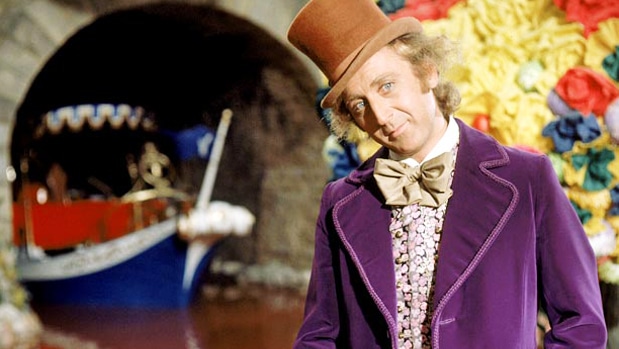
Every once in a while, we here at Digital Ink like to take a break from telling you how you should be doing your work, and let you take a look at how we do ours. It’s like you’ve won the golden ticket to the Wonka factory tour, but you won’t drown in a chocolate river, and there are none of those creepy orange trolls.
How We Work
Every day, we get up at 8am, put on our coveralls and work boots, make a strong cup of chicory, then we fire up our MacBooks. Our graphic design software isn’t really unique or out of the ordinary from what other designers use. It consists of four main tools: Photoshop (the workhorse), Illustrator (the fancy lad), InDesign (the boxy one), and PowerPoint (the ugly one).
Let’s take a look behind the curtain and see what each item in our toolbox is good for, how we use them, and a few things we’ve created with each one.
Photoshop
What It’s Good For
Photoshop is largely used as a photo editing tool. It’s powerful layer effects make it a great tool for most kinds of graphics editing, and it’s even used to make animations and simple websites. It is a massive program with so many possible applications that, even after several years of use, you might discover a new layer effect or filter that you had no idea existed.
How We Use It
We primarily use Photoshop in conjunction with our website design projects. That means we are using it to churn out buttons, slider graphics, and other user interface elements that we plug in to WordPress sites. In the past, we have also used Photoshop to create entire mockups that we then break into component slices and use to develop our custom site templates.
Projects We’ve Completed with Photoshop
| Algosec Blog Redesign | Jericho City of Praise |
 |
 |
Illustrator
What It’s Good For
Photoshop and Illustrator are somewhat similar and, for a lot of things, can be used interchangeably. The main difference is that Illustrator exports scalable, high-resolution vector graphics. Scalability is important when you need to use one graphic in different sizes (like a logo) without losing resolution. Vector graphics are also generally smaller in file size, which is great for loading on a website. Here is a more detailed explanation of vector graphics (as opposed to raster graphics).
How We Use It
Illustrator was originally developed as a way to create digital illustrations that could be scaled up and down and kept at a low file size. So in addition to creating illustrations and infographics, we like to use Illustrator to create logos and icons (things that will almost certainly need to change size depending on how they are being used).
We also generally create our site mockups in Illustrator because of how much easier it is to move and duplicate objects and layers. The convenience of having multiple art boards is also huge, as it lets you see the different parts of a site simultaneously, and they can all be exported individually as JPGs or PSDs for easy review and development.
Projects We’ve Completed with Illustrator
| Fanspeak Tim Tebow Infographic | Remarkable Hire Illustration |
 |
 |
InDesign
What It’s Good For
InDesign is a robust page layout application, used almost exclusively for print media. It is really the only software to use, although some people (Marxists) like to use Quark Express.
How We Use It
Recently, we’ve used InDesign to create e-books. With it’s PDF export capabilities and Adobe Acrobat, it makes it very easy to do. We’ve also used it to produce posters, promotional flyers and business cards.
Projects We’ve Completed with InDesign
| APF Future of Futures e-book | OUA Schools in Session Flyer |
 |
 |
Microsoft PowerPoint
What It’s Good For
Microsoft’s PowerPoint is the dominant presentation design application for most businesses and individuals. There are other contenders out there, like Apple’s Keynote and Prezi, but basically everyone has committed themselves to using Powerpoint until the bitter end, like that cowboy in Dr.Strangelove.
How We Use It
We create templates and apply sound information design practices to business presentations. By that, I mean we help our clients transform their carefully researched information into a visually pleasing and understandable presentation for their large corporate clients.
Generally, we try to create all of our visuals within PowerPoint, but we often incorporate icons or other graphics that we create in Illustrator or Photoshop.
Projects We’ve Completed with PowerPoint
| L’Oreal Men’s Grooming | Bank of America Cash Presentation |
 |
 |
We hope you’ve found this peek into our work flow to be enlightening. And look, no one was zapped into a tv or turned into a gigantic blueberry! Awesome!
Contact us to see how we can use our vast knowledge of Adobe Creative Suite and Microsoft Office to help you with your project.

