9 Ultra Creative Business Card Designs for Inspiration
by Jason Forrest
Insights / Graphic Design /
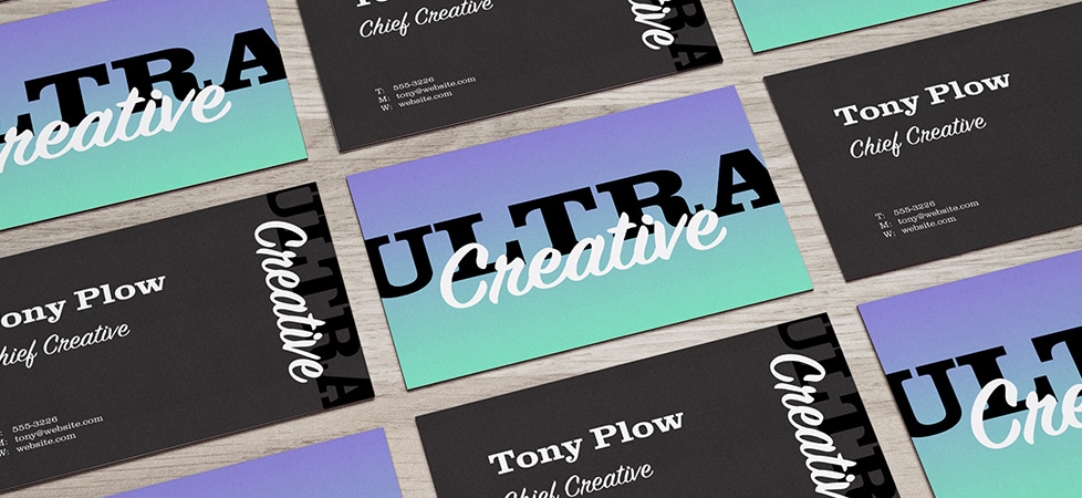
A great business card should be memorable and well-branded, with easy-to-read information about your business or organization.
There are a lot of different ways to design a business card, so choosing the best approach can be overwhelming.
Let’s explore nine ultra creative business card designs to help inspire your search for the perfect design.
1) Minimalist Business Cards
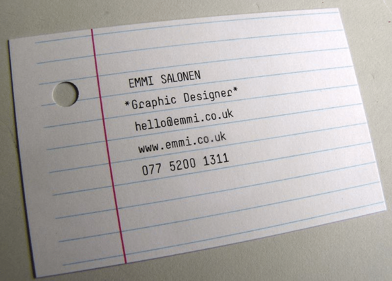
This business card by designer Emmi Salonen is a great example of effective minimalist design.
The lines of the college-ruled notebook paper create a stage that effectively frames the contact information.
The design is also on-brand for her business, and leaves a memorable impression.
2) Maximalist Business Cards
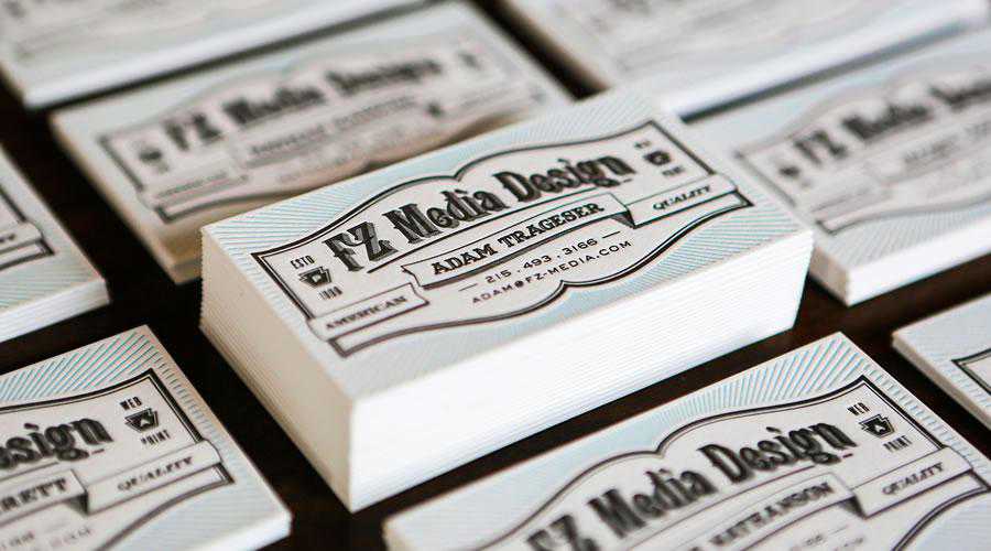
The design of FZ Media‘s business card creates a lasting impression by going maximalist.
In this context, “going maximalist” basically means effectively using a combination of bold fonts, colors, shapes, icons, and/or patterns.
Given that letterpress is a retro printing technology, it makes sense that FZ Media Letterpress’s design uses a variety of vintage ornamentation to communicate their brand.
3) Vertical Business Cards
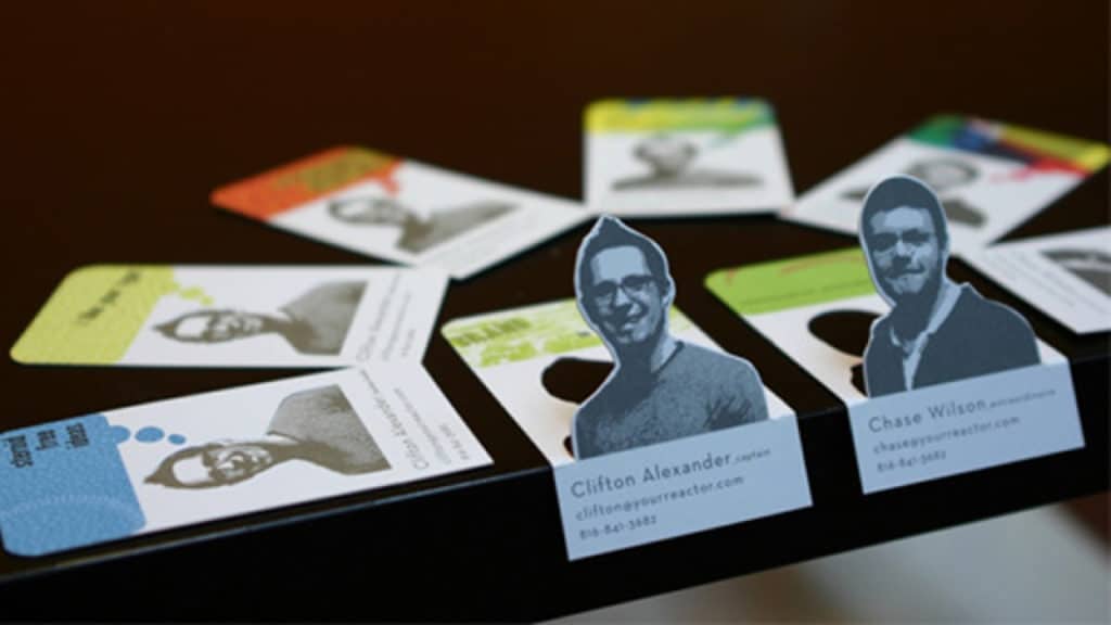
Image via Mashable.com
Since business cards are traditionally designed for viewing horizontally, a vertical or portrait orientation design can really stand out.
The downside of portrait orientation is a smaller amount of space for conveying essential information. However, portrait orientation is well-suited to using photography.
The pop-up portrait in this example can sit on your desk, as a friendly reminder of who gave you the business card.
4) Smart Business Cards
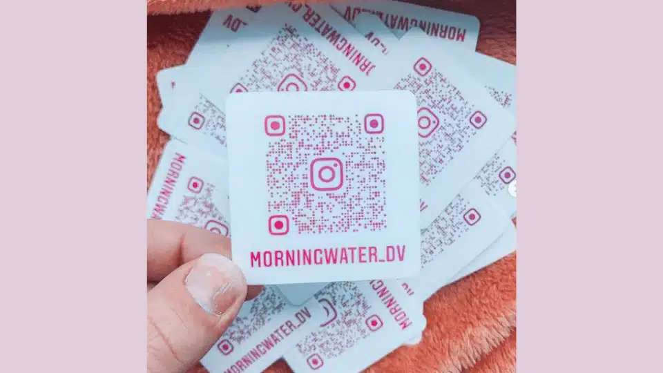
Image via QR code Generator
Including functional tech in a business card design, specifically QR codes, is becoming common practice.
This business card design example is a combination of a business card and a sticker.
The QR code is the center of attention, with the only other information being the Instagram handle, which strongly invites the curious viewer to scan the QR code to learn more.
However, it would be a slightly more effective design with a little more information. You can’t always rely on sheer curiosity to drive engagement with your brand.
5) Uniquely Shaped Business Cards
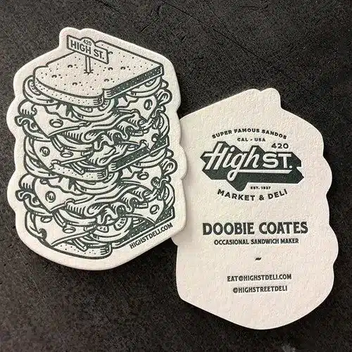
Image via logosbynick.com
Another way to create a lasting impression with your business card design is to use a creative shape that references what your business does.
In this case, High St. Market & Deli’s card outlines a fun sandwich illustration, with the business information on the opposite side.
While a unique shape can make for a memorable design, you have to be careful that there’s room for essential information, and most importantly, that it can be easily stored and transported by the person you give it to.
6) Functional Business Cards
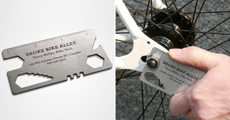
Image via justsomething.co
An intriguing way to design a business card with a lasting impression is to make it functional.
This business card example functions as a multi-tool for quick bicycle repair. A functional business card design encourages people to keep it around, ensuring that they’re repeatedly looking at your business information.
You can easily envision a scenario where they go to tighten their wheels, whip out your multi-tool card, and next thing you know they’re making an appointment for a tune-up!
7) Business Cards Printed on Unusual Materials
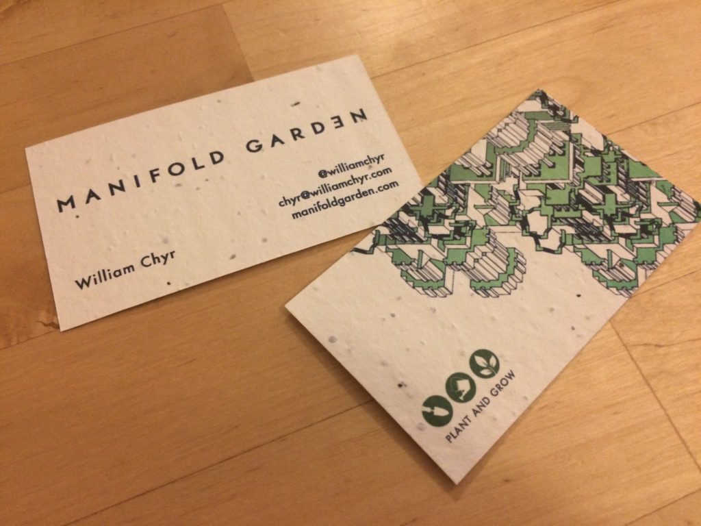
Image courtesy William Chyr via Forbes.com
There are a lot of options for materials other than card stock to consider when designing a business card.
This example uses a compostable material that breaks down and serves as a medium to grow the seeds embedded in the card.
There aren’t many more memorable impressions than a plant on your desk that used to be a business card.
The downside is of course you have to hope the recipient got your information before they planted the card.
8) Business Cards with Headshots
Design courtesy of Bloom Design
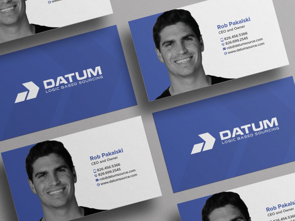
Another common practice in business card design is to include a headshot along with the usual contact information.
Headshots are a great way to connect a name to a face, reminding the recipient of your meeting.
I like this example because the photo is incorporated in a more unique way than simply dropping the headshot into a square frame.
Once again, however, you need to be careful that there is enough room for essential information, and that the photo doesn’t compete too much visually.
9) Interactive Business Cards
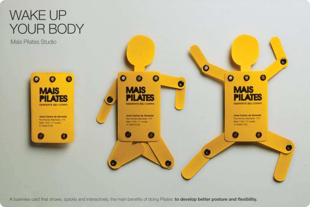
Image via adsoftheworld.com
The idea behind an interactive business card is similar to that of the functional business card.
If the business card is fun to use or has a purpose beyond simply listing out your name and contact information, its more likely the recipient won’t just throw it away.
This example from a pilates studio turns into a figure that can be positioned into various poses, like the ones found in pilates.
Ultra creative bonus points if your interactive design reinforces your mission.
Think Outside of the Rectangle
These nine examples are just the tip of the iceberg.
There is a whole world of ultra creative business card design solutions to experiment and play with. Try combining different methods to see what works best with your brand and your content.
Remember: a good business card design still needs to have clear information and be well-branded.
If you’re still struggling, we can help you design a creative business card solution that suits your brand perfectly.
