Defending The New Cleveland Browns Logo
by Jason Forrest
Insights / Graphic Design /

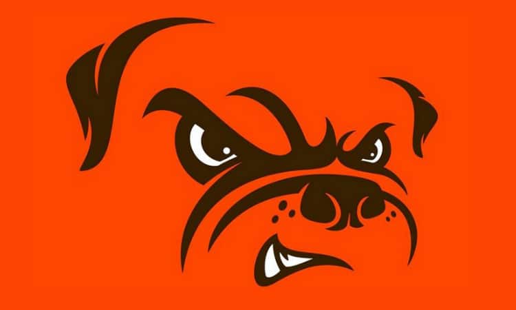
I’m not here to kick the Cleveland Browns while they’re down – they do that well enough on their own. And, full disclosure, Junger and I are both Ravens fans. Today, I’m here to defend the new Cleveland Browns logo.
Any time a high profile company proudly releases their new brand identity, only to be met with laughter and mockery, the most interesting thing to me as a professional graphic designer is thinking about the process that lead up to the unveiling.
Browns logo change. We went from Orange to a little more Orange, and our dog got Rabies pic.twitter.com/3HWg3ocIPi
— Big Cat (@BarstoolBigCat) February 24, 2015
The smallest of companies, up to and including billion dollar sports entertainment entities like the Browns, go through a very large degree of thought and consideration and hand-wringing when they embark on a branding redesign, as well they should. We’ve discussed what that process looks like before on this site.
My take on why designs like the minimal look of the Browns new logo are generally met with stunned derision is that people generally assume that if a designer or team of designers spend a great deal of time working on something, that the final outcome should reflect every hour and minute and second that was put into the final product. But that assumption is erroneous, and is based on a lack of knowledge about the considerations that go into a re-branding effort.
First, you have to consider what the Browns were looking for in their new design. My assumption based on the final product is that they wanted something that still felt like the Browns and that kept their traditions but had the feeling of something new. If you think about it, that aligns really well with where they are as a team right now. They nearly made the playoffs before suffering a very “Browns-ian” late season collapse. They don’t need to completely hit the reset button, but they do need something new.
Second, a designer’s job is to listen to what the client wants and combine that with well-thought out design. What I mean by that is that extensive thought and rounds of mockups will sometimes lead to the simplest looking solution. Consider the old typeface versus the new typeface. It seems like they could have picked that new typeface in a few minutes by simply scrolling through the typeface options in Photoshop. But if you think about it, throughout their history, they’ve used the same sans-serif typeface all the way up to 2006, when they started using the slab-serif typeface that they just replaced. In my opinion, the new typeface is more reminiscent of their earlier logos, while taking on a new, more aggressive tone.
Let’s also consider the new, fluorescent orange primary brand color. Sure, you could say that it is possible the designers simply opened up Photoshop, increased the brightness, and called it a day. But if we refer back to the history of their team brand, what we notice is that the primary color has been getting increasingly bolder and brighter over the decades. The new design is clearly a progression of the Browns identity. Again, it is recalling their history while promoting something new.
Finally, let’s all agree that the point of re-branding is to get the public talking about your product. And when was the last time this many people were talking about the Cleveland Browns? Regardless of what your feelings are about the aesthetics of the new Cleveland Browns logo, we have to call it a success.
You’re welcome, Browns fans.


