The Airbnb Logo Redesign: Learning from the Controversy
by Jason Forrest
Insights / Graphic Design /

Last Updated: December 20, 2024
Airbnb, a company that lets people rent rooms from private individuals, officially launched a new logo design in 2014.
Immediately, a collective chuckle was heard from the entire Internet, who proceeded to make dirty jokes at Airbnb’s expense.
Seriously, we aren’t going to link to all the incredibly raunchy posts about what the new logo looks like (you can Google it yourselves), but we can say some people think it looks like various parts of the human anatomy.
The Laudable Goals of the Logo Redesign
Why did Airbnb design a logo like that?
Well, that really depends on who you’re talking to. They are calling it the “Bélo,” which is sort of a fancy truncated version of “Belonging.”
See, they paid London-based DesignStudio to launch a new branding campaign for them, and the thinking that went into the new brand is actually really impressive. You can read their case study about the design to find out more.
In the illustration above, you can see the different emotional elements that make up the final logo. And when you look at the final logo, you really can see all of those individual parts (which is really hard to do in something so minimalistic). If we are judging the final logo on whether or not it conveys what Airbnb wanted it to convey, I think it is more than fair to say that they really nailed it.
What Went Wrong?
The point has been made that Airbnb, like a lot of companies, has a strong internal culture and may have gotten so caught up in its own grandiose thinking that it failed to see the somewhat obvious “alternative interpretations.” A very similar thing happened to the University of California.
It’s possible that they didn’t do enough testing, which could have revealed the myriad reactions that they got on launch day.
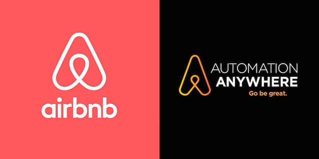
To boot, the new Airbnb logo bears a striking resemblance to that of another small start-up, Automation Anywhere. We are definitely not accusing Airbnb or DesignStudio of any form of plagiarism, but it’s curious how that happened, especially since the two companies are aware of each other’s existence.
Airbnb and Automation Anywhere actually released a joint-statement about the controversy:
In early 2014 both Airbnb and Automation Anywhere began use of new logos that, by coincidence, have similar designs. Airbnb and Automation Anywhere are working cooperatively to address this issue, and Automation Anywhere is in the process of transitioning to a new logo design that is not similar to the Airbnb logo.
It is also more than likely a case of minimalism, infinite loops, sans-serif and flat design being all the rage right now, and not any ill-intent on the part of Airbnb. Automation Anywhere has since launched a new logo that is more distinct from Airbnb’s logo.
What Should We Make of It?
Airbnb is basically a lightning rod already, and as far as the Internet is concerned, it’s open season for scrutiny. So the overwhelming reaction wasn’t really a surprise, and shouldn’t have been to Airbnb either. (It’s unlikely to be consider an iconic logo any time soon.)
From a graphic design perspective, the logo is a success, and at its core the Internet is fickle and has a very short-term memory. So let’s all have a good laugh at the silly new Airbnb logo and realize that no matter how much you think through your design, someone is going to think your logo looks like boobs.
Airbnb isn’t the only company to have a less-than-successful rebranding; the NFL’s Washington Commanders’ rebranding missed the mark. If you’re looking for iconic brand makeovers, however, know that they do exist.


