Above the Fold: It Does Exist!
by Jason Unger, Founder
Insights / Content /

Even though I have a degree in Broadcast Journalism, I’ve been building and maintaining websites since the mid-1990s, before I went to college. When I started at Boston University in the Fall of 2001, there wasn’t a degree for what I did.
You could get a computer science degree, but that was always more programming-based than web-specific. (If your eyes are glazing over already, don’t worry — I’ll get to the point shortly.) So I ended up with a journalism degree because the same skills that you learn as a journalist – telling stories, collecting information and expressing it to large groups of people, and marketing your content – are all skills relevant to a website owner.
So even though I built websites and had a degree in Broadcast Journalism, my first job out of college was working at a magazine. I can tell you stories all day long about bringing a web-first mentality to a traditional print publication, but today I want to talk about taking a print idea online.
Above the Fold: Where the Important Stuff Goes
Traditionally, newspapers have placed the most important stories of the day in a spot they call “above the fold.” Like you can imagine, it’s the area on the top of the front page of the paper, above where it’s folded.
The idea with placing information above the fold is that it’s the most likely place where a reader will see it. So it’s obviously a very important spot for newspapers, both for the editors who need to decide what stories go there, as well as advertisers looking to purchase advertising space there.
I’ve blogged a lot in the past about writing for the web, old media vs. new media, and web content, so this is an area I love to talk about. And most of the time it’s helping traditional print publishers optimize their content for the web.
In this case, the idea of “above the fold” translates for the web — and it’s almost as important.
Above the Scroll: Where the Important Stuff Goes
So here’s where it gets funny.
In today’s age of responsive design, mobile devices, iPads, big screens, little screens, multiple screens, and more, it absolutely matters that your most important information goes above the fold (or, as it’s been coined, “above the scroll”).
Here’s how Amy Schade, writing for the Nielsen Norman Group, explains it.
The fold matters because what appears at the top of your page matters. Users do scroll, but only if what’s above the fold is promising enough. What is visible on the page without requiring any action is what encourages us to scroll. This is true on any size screen, be it mobile, tablet, or desktop: anything that’s hidden and that the user must uncover will only be seen if the user deems it worth the hassle.
What Schade recommends, and what you need to consider if you’re doing a website design, is how do I get people to scroll past the fold.
This site is a great example of content encouraging you to scroll past the fold. You scroll because you want to continue reading. The content pushes you forward, so you continue to go.
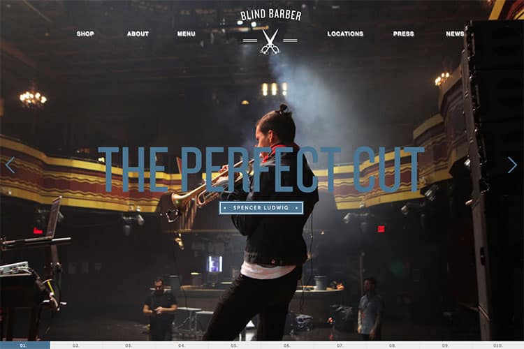
If it’s not content encouraging you to scroll, visual cues can do it, too. The beautiful website for the Blind Barber does this well; you’ve got both left/right arrows and numbers indicating where you are in the process (also great for usability).
Here’s more tips for getting users to scroll.
How to Handle the Fold
Look: telling you that a fold exists isn’t a recommendation to just stuff everything at the top of your homepage. That’s a dumb design idea and really bad usability.
Web users do scroll – so it’s not like they’re not going to know what to do on your site, especially if you’ve got a traditional design. But if you’re trying something new – or even if you’re not – think about where you place your most important content, and how to get people from point A to point B.
Think about this. The Nielsen Norman Group did more than 57,000 eye-tracking fixations, and this is what they found: the 100 pixels just above the fold were viewed 102% more than the 100 pixels just below the fold.
Curious about where your site’s fold is? Check out Fold Tester, which shows where the fold will be for web users across the world.
So give credence to the idea that placing content above the fold is important, but certainly don’t forget about telling people clearly why they should scroll and what links to click next.


