7 Compelling Call to Action Designs

A call to action (CTA) is a “marketing term for any design to prompt an immediate response or encourage an immediate sale.” We know CTAs are important when it comes to guiding your user to take the next step. But what are the building blocks of a call to action, and what sets a good CTA apart?
That’s what we’re here to explore.
What Makes a Compelling Call to Action?
A compelling call to action is a combination of marketing, layout, and web design best practices. It is what compels you to sign up, act now, donate, and try for free today. We’re big believers in not reinventing the wheel, and instead learning from the best.
Here are seven examples of compelling call to action designs that could help drive traffic and engagement on your website.
HelloFresh Banner
Source: Hello Fresh
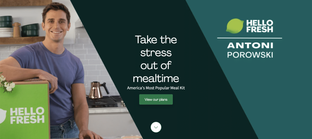
The dread of having to decide what to do for dinner is an almost universal human experience. And who among us is a fan of stress? And furthermore, who doesn’t love Antoni from Queer Eye?
If you were already thinking about whether to try HelloFresh, you’re definitely going to click that button. The combined use of social endorsement and language that capitalizes on shared experiences makes a very compelling call to action.
charity: water Newsletter Signup
Source: charity: water
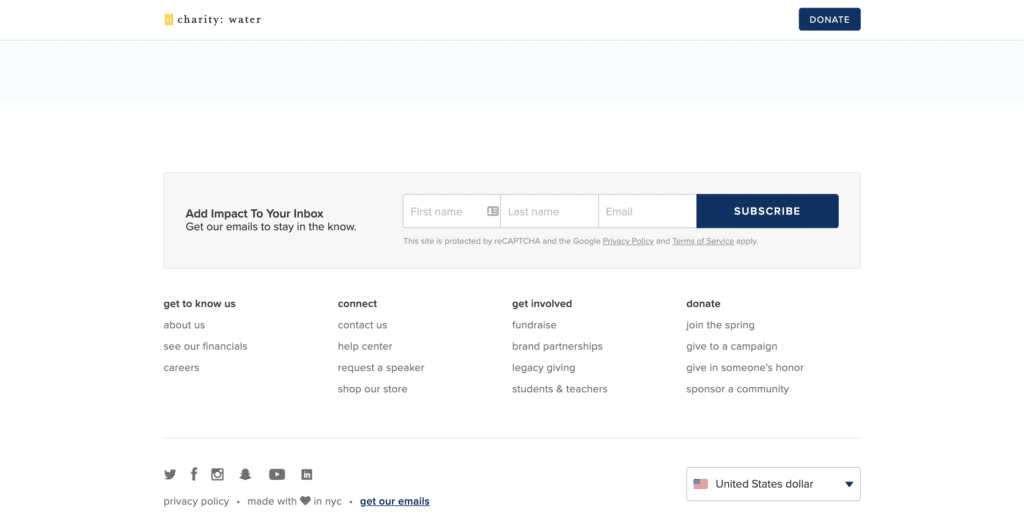
I love charity: water’s tagline, “Add Impact to Your Inbox” — it’s brief, yet sends a strong message. While the design is simple, bordering on plain, it allows the language to speak for itself, stating that their email content is worth a subscription.
Defenders of Wildlife Donate Module
Source: Defenders of Wildlife
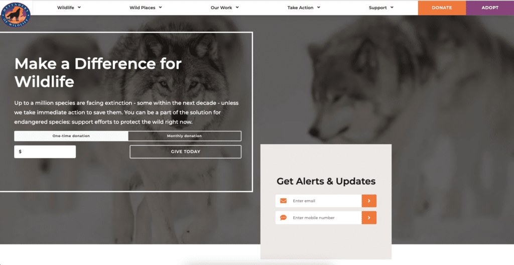
Defenders of Wildlife features a CTA in the center of their homepage, as opposed to the bottom. I’m a big fan of being able to complete an action without having to go further into a site. The stylish background image combined with visually clear options and language makes a very effective invitation to donate.
However, it would be better if it also included a preset donation amount instead of asking the user to fill in an amount of their choosing. (Side note: It would be perfect if you got one of these shirts with every donation.)
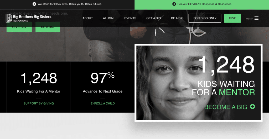
Big Brothers Big Sisters Independence ‘Become a Big’ Tile
I love the combination of the smiling girl making direct eye contact with the viewer and the data set in eye-catchingly large font. Juxtaposed with the other numbers, they are boldy stating that if you don’t click this link to become a Big, you’re letting this child down, and by extension every child in need of a mentor.
You don’t want to be that person, so you know you’re clicking that link.
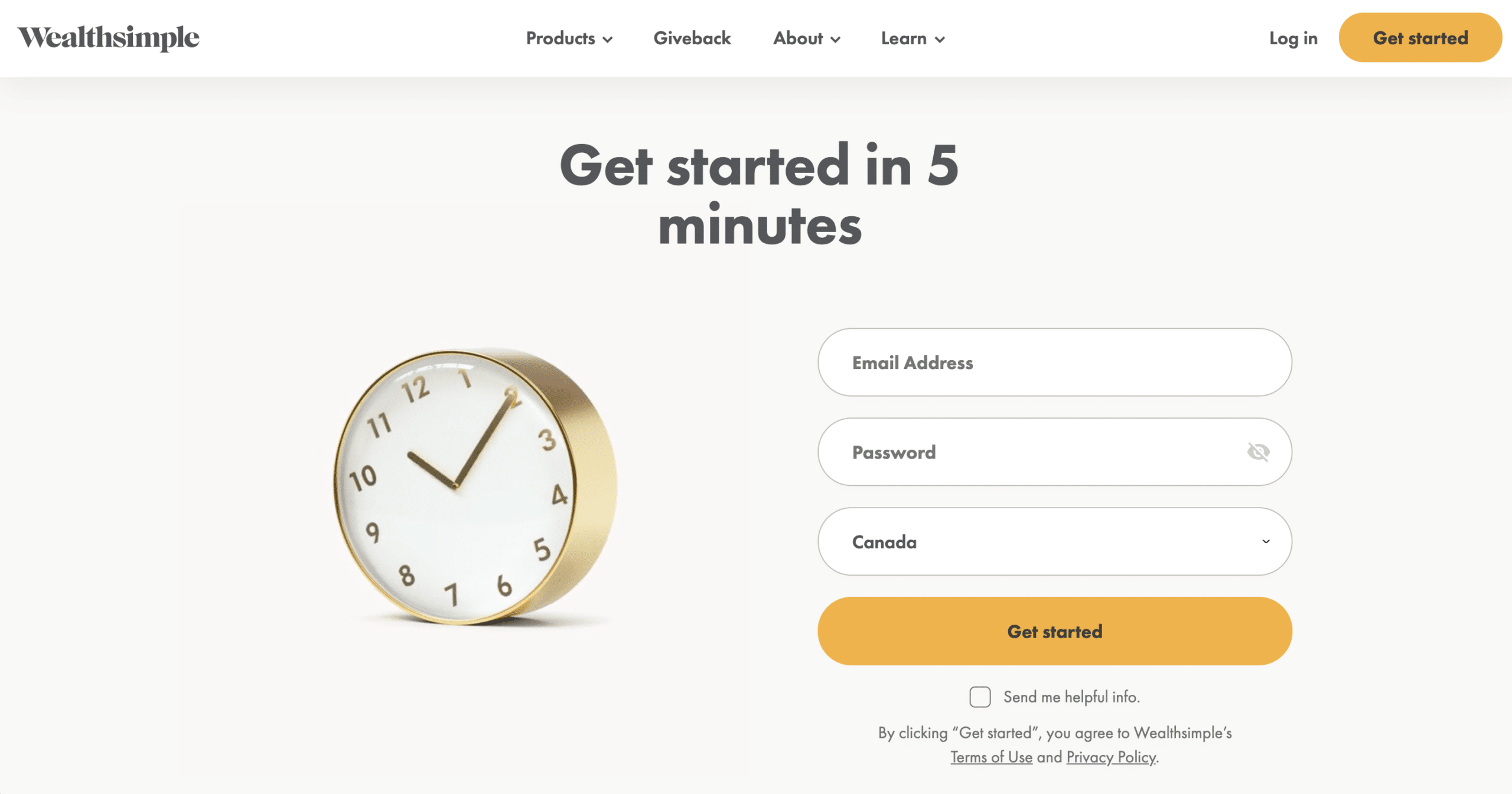
Wealthsimple ‘Get Started’ Footer
Source: Wealthsimple
Here is another example that capitalizes (wealth, get it?) on a universal human experience. Many of us feel like we have no time to accomplish even the smallest of tasks. And most of us are actively stressed about money.
According to this design, there’s a way to solve both of those problems in 5 minutes. I find that very compelling. The overall design is simple yet extremely effective.
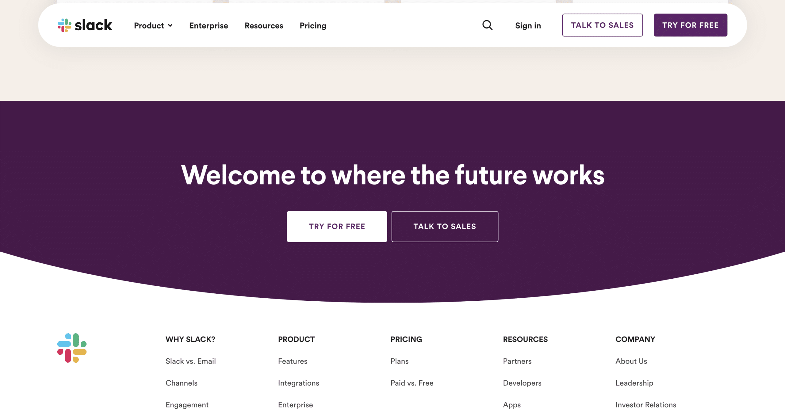
Slack Free Trial Footer
Source: Slack
This example of a free demo call to action that is as visually compelling as it is strong in its messaging. No one wants to feel left out of the party, especially when every second you’re not at the party you’re losing money. We’ve seen how compelling social pressure is when paired with good design.
No one is immune, us included.
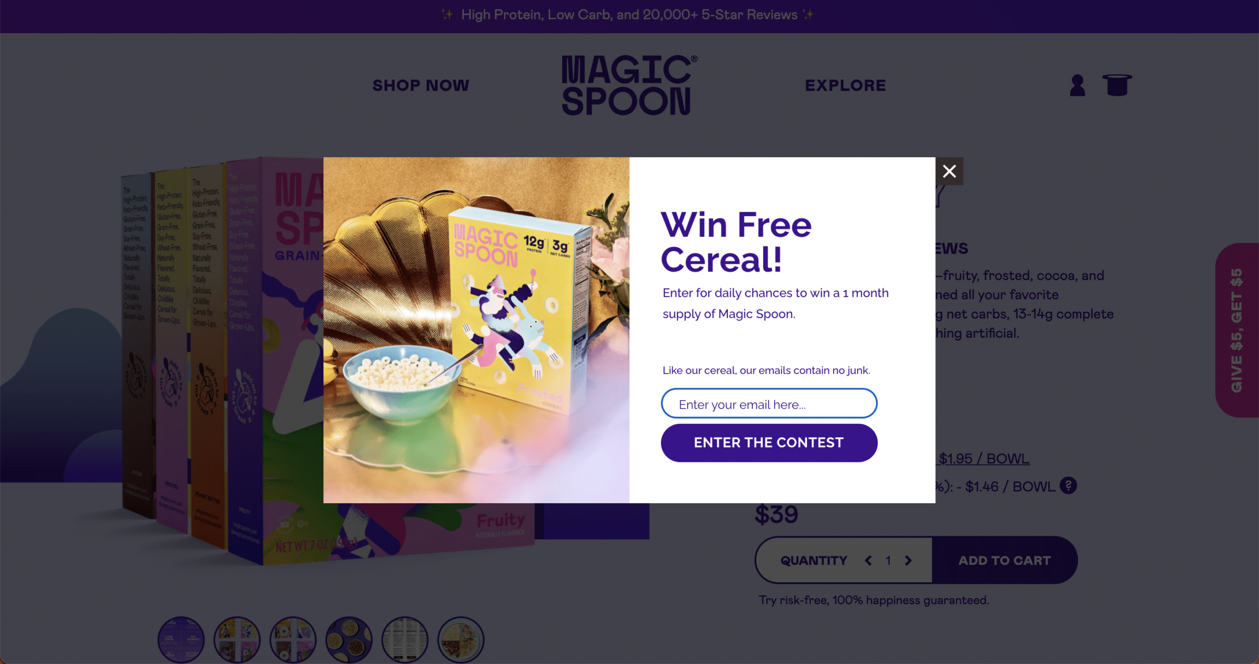
Magic Spoon Pop-Up
Source: Magic Spoon
Who doesn’t love cereal? Free cereal no less? No one loves pop up ads, but it helps sweeten the deal when it feels like you’re getting something out of the experience.
All of these examples share an emphasis on language, visuals, and most importantly, making the call to action relevant to the user and their experience.
Contact us today if you’re feeling compelled to improve your call to action designs.
