Typography 101: Website Legibility

When you’re building a website, legibility is key.
Information should be easy to find and easy to digest. If users encounter sites that are difficult to read, it can quickly lead to overwhelm and frustration. Understanding what makes text legible will help you avoid common mistakes, and will create a more enjoyable user experience.
In order to do so, here are three key areas to consider:
Size & Contrast
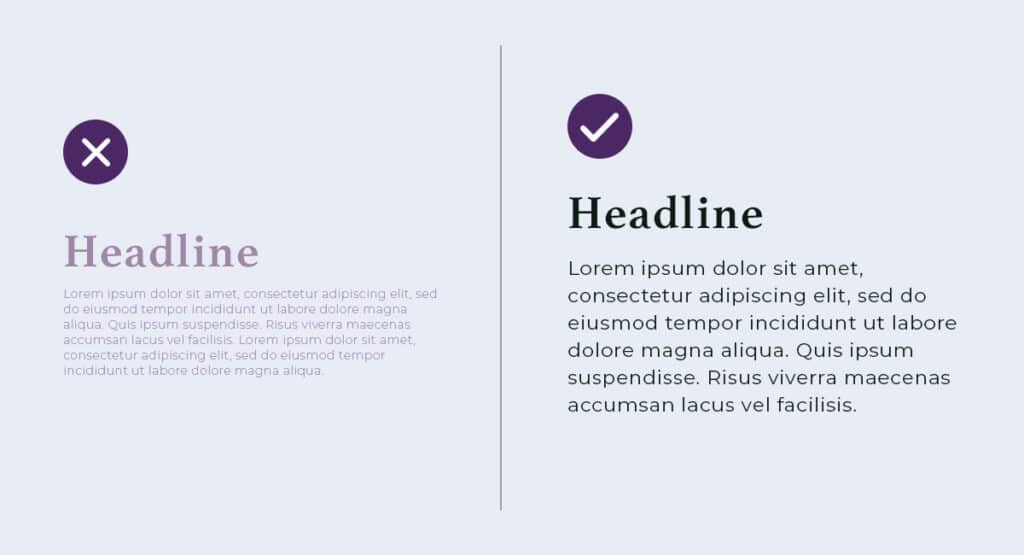
There isn’t one font size that works best universally, since each individual typeface has its own unique qualities – but a common recommendation is to remain somewhere between 16 and 20px for text on desktop.
Keep in mind that background colors and design elements can make text more difficult to read, so it’s important to ensure you’re working with a high enough contrast ratio. You can learn more about specific requirements, and can check contrast ratios using the WebAIM color contrast tool.
Hint: Depending on your audience and specific needs, you might also consider including accessibility tools that allows users to customize the size and appearance of text.
Typeface
Selecting typefaces for your website is one of the best ways to incorporate your brand look and feel, but it’s crucial to consider legibility when doing so.
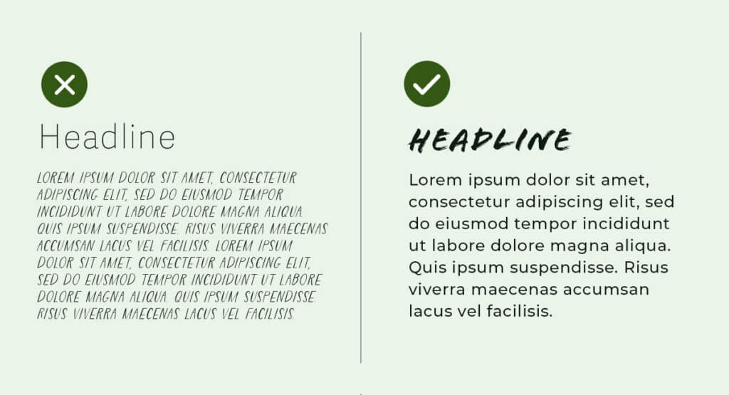
It’s generally considered best practice to use sans-serif fonts for body copy due to their clean appearance and easy scalability. Using serif fonts is acceptable, as long as the size and contrast ratio are sufficient. Any decorative typefaces, such as script or handwritten styles, should be reserved for headlines only – as shown in the example above.
Not sure where to start? Most font libraries make it easy to find what you’re looking for by including filtering capabilities, and we’ve highlighted amazing fonts before.
Hint: Left-aligned text is typically the easiest to read, and should be the default for body text. Short amounts of centered text are OK – but for anything longer, like a blog post, stick with left-alignment.
Leading
When we talk about white space, we sometimes also refer to it as “breathing room”.
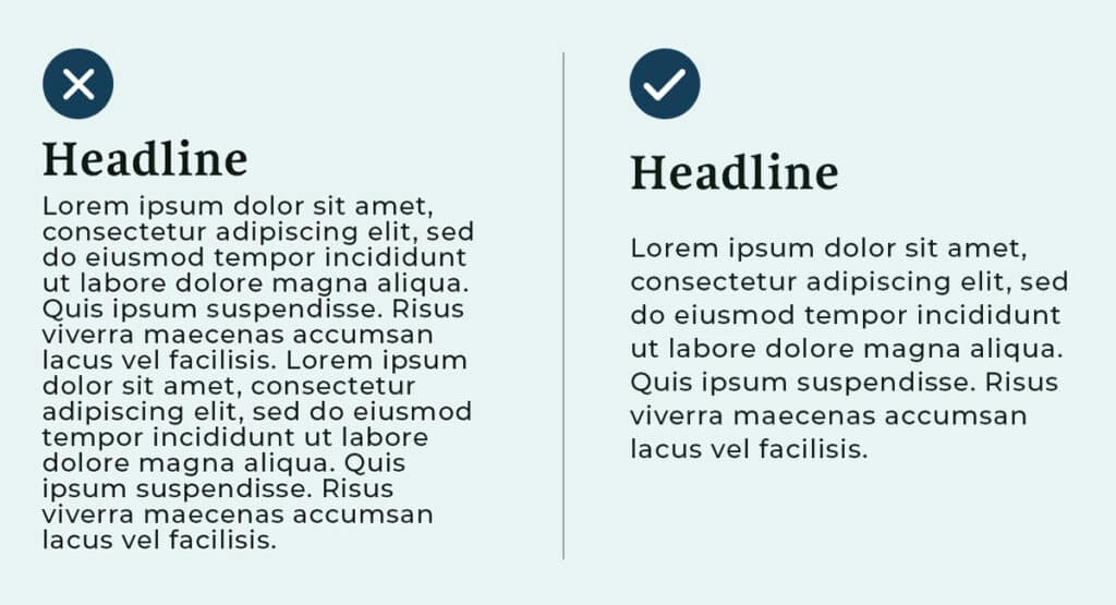
Giving text some open space helps to reduce overwhelm and keep things scannable. Leading, or line height, refers specifically to the space between lines of text.
In the example above, you’ll notice that when text is crunched too closely together, it is very difficult for our eyes to process. The opposite can be true, as well – too much space between lines of text can lead readers to get lost as they scan. But when you have the right balance, reading through a paragraph of text is a smooth and enjoyable user experience.
Hint: In addition to leading, make sure margins and padding are being considered to avoid the look of an overly crowded page!
Need help with improving your site’s legibility? We’re here to help.