7 Examples of Creative Mega Menu Designs
by Jason Forrest
Insights / Website Design /
Last Updated: December 20, 2024
What Is A Mega Menu?
A mega menu is an expandable menu that packs your website navigation into a single interface. Mega menus are especially useful for sites with vast amounts of content, such as e-commerce websites and blogs.
The goal is to present the information clearly without forcing a user to dig through a maze of inner pages. While there are many ways to design a mega menu, layouts can easily become overwhelming.
Designs can include categories, images, embedded content, iconography and other visual clues, to help a user easily find what they are looking for. Without a mega menu, navigating even the most popular websites would prove frustrating and fruitless.
We’ve sourced 7 examples of creative mega menu designs that go above and beyond the call of duty. Let’s dive in!
1) Citadelle Gin
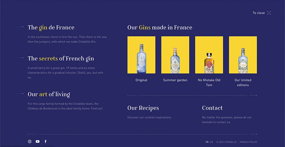
This mega menu design from Citadelle Gin uses a full-screen overlay approach, as opposed to a more common drop-down menu style.
While it does not contain a ton of content, the simple, yet creative design is eye-catching and effective.
Instead of listing their products out alphabetically, this full-screen menu includes vibrant product photography, which helps draw the eye as well as paint a fuller picture about their products.
2) Atlassian
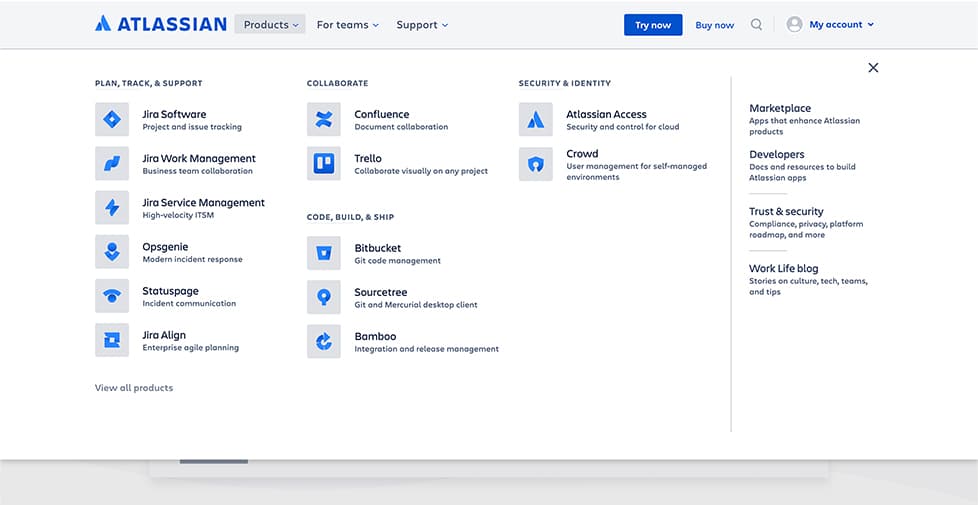
Atlassian’s mega menu design is less artistic than Citadelle Gin’s, but the minimalism is extremely user-friendly.
The menu organizes all of their product categories with the user’s goals in mind. The clear layout makes it easy for the user to quickly find relevant products directly from the home page.
The iconography associated with each product also makes the design more visually interesting, while remaining readily scannable.
3) Apose
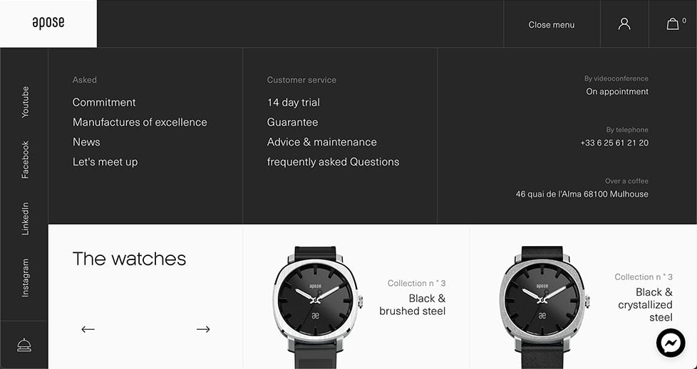
The Apose mega menu is an excellent example of design that seamlessly integrates interactivity, through the use of a carousel.
Much like Citadelle Gin, instead of simply listing out their products in a column or table layout, they have added high resolution product photographs. The photographs actively draw the eye and point the user in a specific direction, while also bolstering the overall branding of the site.
My main gripe with this example is that they have hidden some of their products on internal pages, making it difficult to get a sense of all their offerings.
4) Refinery29
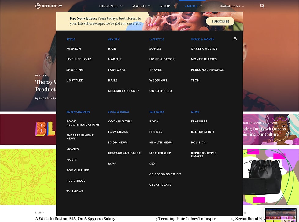
Refinery29‘s mega menu is unique in that it integrates a newsletter-sign up banner at the top. I love how they were able to include this call to action without visually overwhelming the menu.
The very clean organization of the menu categories is minimalist and straightforward. The menu also has a colorful hover effect that varies depending on which dropdown you’re interacting with.
5) Briogeo
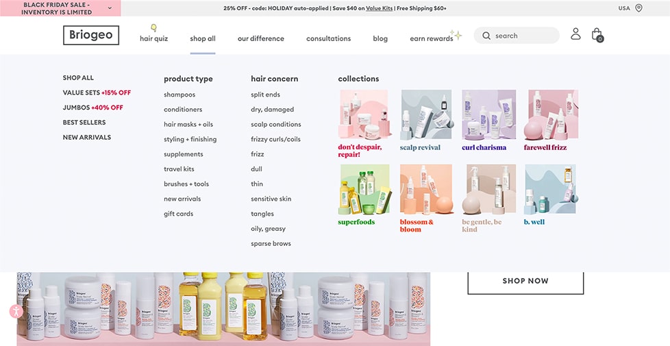
Beauty retailer Briogeo has an extensive and beautifully branded mega menu.
While the layout doesn’t reinvent the wheel, they manage to include all of their products, as well as eye-catching product photography, without becoming too busy.
Cleverly, the menu also includes a category of problems that their products solve like split ends and frizz, guiding users based on their needs. It is the platonic ideal of e-commerce mega menu design.
6) Wild Souls
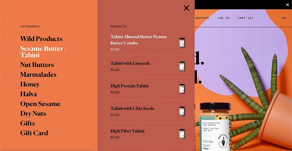
This mega menu example from food retailer Wild Souls isn’t perfect, but is still worth sharing.
Obviously, it is very well branded, clean, and easy to scan. What sets it apart is the menu appearing on the side of the screen, as opposed to a drop-down or full screen overlay.
Where it loses some points is that you have to scroll in order to see all of their products of a certain category, and it isn’t totally clear that the list goes on.
So while it is a creative mega menu design, there is still room for improvement from a user-experience perspective.
7) Starbucks
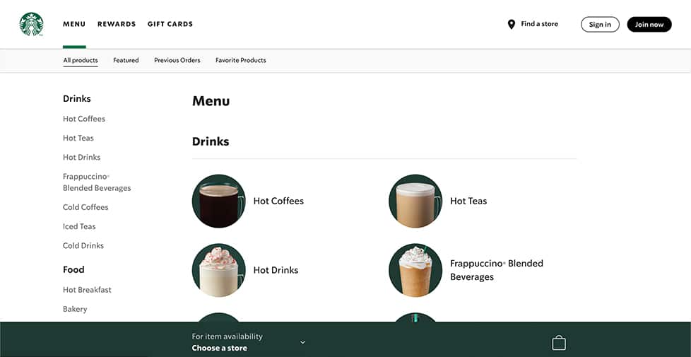
I saved the best for last. Starbucks has a million different kinds of drink and food options, and they essentially built an entirely separate menu page to fit all of it.
Its layout has plenty of clean white space, is clearly organized by product type, an overall is extremely easy scan. When a user clicks a top level product, the menu displays delicious looking product photos within that category.
However, I do have a hard time imagining anyone else but Starbucks, or a brand with as much recognition as they have, using this exact design. I criticized Wild Souls for hiding some of their products and not making it clear that you have to scroll to see more.
Even though this design has some of the same issues, it gets away with it because users are coming to the Starbucks site with a clear idea of what they want.
What Now?
Now that you have a better idea of what possibilities exist in the world of creative mega menu designs, let us help you apply these concepts to your site’s menu.
And while these mega menus look phenomenal on desktop, designing for mobile requires creatively adjusting the experience for a smaller screen size.
Reach out to us so we can help improve your menu’s design and usability.
