A Designer’s Guide to Finding Inspirational Websites
by Jason Forrest
Insights / Website Design /

Despite the fact that I consider myself a successful and skilled designer, I always look for new designs that inspire me to create better products.
When I’m searching for website design inspiration, I’m typically looking for these key design criteria:
- Does it tell a story effectively? This is my most important criteria. It’s the one thing every project I work on must do well; from a simple flyer to a multi-page interactive website.
- Is it unique? I’m not going to be inspired by something I see everywhere, which means neither will my audience.
- Does the experience make me want more? If I don’t want to spend time exploring the site, that means the design isn’t nailing the first two criteria.
With this inspiration framework in mind, let’s take a look at a few sites that do inspire me:
Charity Water
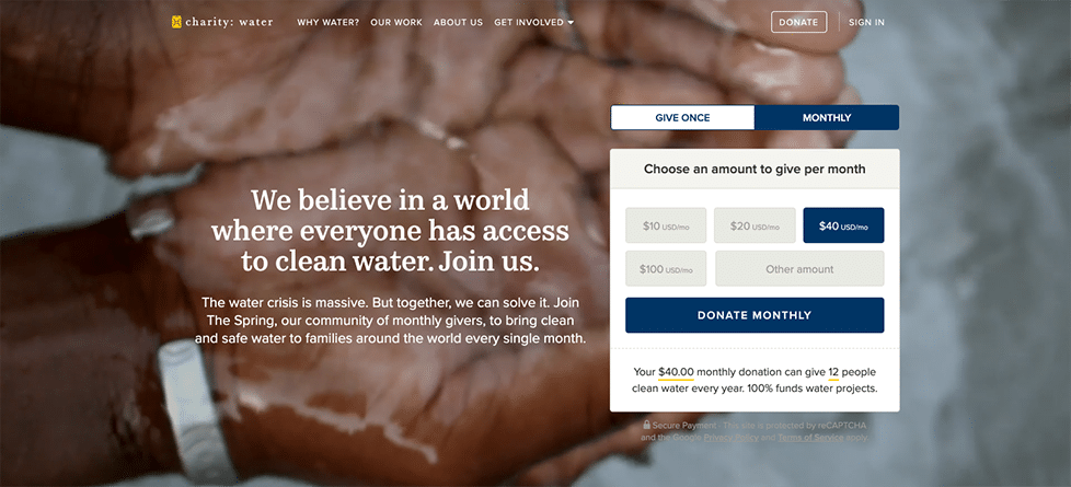
I’ve loved the Charity Water site for quite a while now. It repeatedly comes up when we talk to our clients about websites that they love and want to emulate — and for good reason.
Right away, they’re telling a story about who they are and their mission, using a banner of beautiful videos. Having that powerful imagery juxtaposed with an effective donation page is a slam dunk experience.
Charity Water combines all of that gorgeous narrative imagery with unobtrusive typography, simple illustrated icons, and a very clean layout. They tie all of those elements together with excellent messaging and powerful calls to action. This thoughtful design makes the experience of learning more about their mission truly engaging.
Game Changers
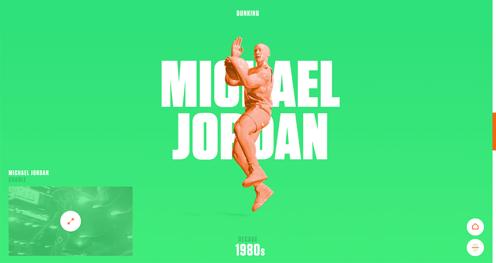
This ESPN microsite, which accompanies an article on the NBA’s best signature moves, is a love letter to the game of basketball – and it’s straight up fun.
The site takes you through the evolution of the core skills of basketball, including shooting, dribbling, passing, and everyone’s favorite — dunking. Each skill is treated like its own landing page, taking you on a tour of the best players that mastered that skill throughout history. The best part is that they include archival footage of each player, which makes the experience really interactive and fun.
Game Changers makes getting through the site easy by using multiple navigational elements, including arrows at the bottom of each page, a simple expanding hamburger menu organized by player, and additional directional arrows within that menu.
Combined with the playful typography and toy-like players, the whole experience reminds me of the joy I feel when I rifle through my old basketball cards from the closet and try to find all of my favorites. Any site that evokes that kind of emotion is a winner.
Eleven Plants for Dum-Dums and Cool Ppl
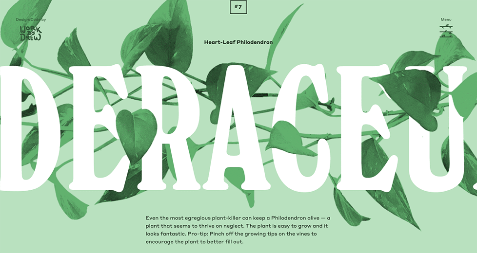
This experimental landing page was created as a passion project to celebrate two things that I love: plants and typography.
It may seem like a joke — which it is, kind of — but it actually does an incredible job of showcasing all the amazing things that can be done with typography on the web right now, and imbues each typeface with a unique houseplant personality.
The experience is like reading the most beautifully designed botany textbook you’ve ever seen. Unique flourishes such as care instructions with accompanying typography, different animations for each plant, and even a hamburger menu icon that resembles a vining plant, combine to create a very engaging theme.
I challenge you to read through to the bottom of the page and not have an urgent desire to buy a cool new plant for their house. And isn’t that the goal of every website? To inspire an action based on a great story.
Finding Inspiration Websites For You
If you’ve been inspired by the unique designs of these websites, you may be thinking that it’s time to redesign your website — but you may not know how to get started. That’s where we come in.
We help our clients explore what a redesign might look like by putting together an Inspiration Deck. The deck consists of a few websites that have designs or functionality that we think could help their new website stand out.
There’s no cost and no commitment — just an opportunity to get some ideas on paper and see if there’s anything that makes sense to pursue.
If you’re interested in a custom Inspiration Deck, contact us to get the conversation started. We’re here to help you tell your story.


