Here’s How to Build an Effective Donation Page
by Sarah-Leah Thompson
Insights / Content /

Photo by Roman Kraft on Unsplash
Imagine that you’re walking down the street and you see a bakery with a beautiful store front.
You walk inside and see shelves of enticing baked goods. But, when you walk up to the cashier to make your purchase, you’re disappointed to find that they have an outdated point of sales system.
After a few minutes of trying to pay for your dessert, you grow impatient and leave the store, frustrated and pastry-less.
If the website for your nonprofit organization has an awesome home page and great content, yet lacks an effective donation page, you’re going to lose out on potential donors for the same reasons.
Customers and potential donors alike want their payment experience to be quick, easy, and reliable.
Thankfully, there is plenty of research and tips that can help improve your donation page to maximize efficiency and ease-of-use. Here are some of the most useful tips to elevate your organization’s donation page.
Set a Goal
First of all, make sure to have an established goal in mind. While one may assume that the goal of a donation page is simply to maximize donations, defining a more nuanced goal will help determine the layout of your page.
Consider goals such as retaining current donors, raising money for a specific campaign, encouraging committed donors to give more frequently, or capturing new donors.
Call to Action
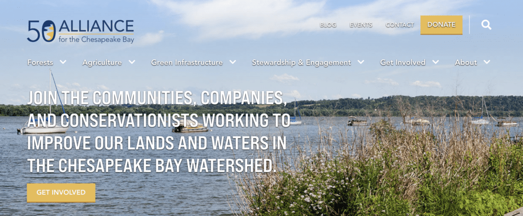
In order to accomplish this goal, you want to make sure that your donation page is easy to access throughout your website. Make sure to feature a prominent button somewhere on your site that brings users directly to the donation page. Consider having the button in multiple locations, such as the header, footer, main body, and/or in a pop-up.
Make it Easy
Once users are brought to the donation page, the primary objective is to curate a user-friendly payment process. Make sure there is a secure credit card authorization form embedded in the page.
Some users prefer alternative payment methods such as mailing in checks or using third-party vendors like PayPal or Venmo. It’s important to have these additional payment options available, as well.
When it comes to structuring your donation form, make sure to only include fields that are strictly necessary, in order to cut down on the time it takes visitors to fill out the form. Build in helpful shortcuts such as autofill for emails and home addresses, which will speed up the process.
Suggested Donations
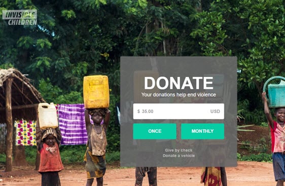
Another shortcut that benefits potential donors and organizations alike is providing a range of suggested donation amounts. The use of suggested values is a marketing technique called “anchoring.” Anchoring provides a frame of reference for your potential donor, and tends to result in a donation closer to the amount suggested than otherwise.
Make sure to also provide an option for donors to specify their own custom donation amount.
Generally the suggested donation amount ranges from $25 to $5,000. If you’re not sure what amounts to include for your website, try testing out a few variations over time, and keep track of the donations you receive during each variation.
Recurring Donations
Another worthwhile option to provide donors is a recurring monthly donation. Some donors want to do their part to support your organization, but can’t afford a large donation all at once.
Including the option to give in small amounts over time will make sure these donors aren’t discouraged from supporting your organization.
Mobile Responsive
In the last year, half of all nonprofit website traffic came from mobile and tablet users, and the amount of mobile donation transactions increased by 17%.
It is essential that your organization’s donation page is easy-to-use on both desktop and mobile devices, to maximize conversion rates across all devices.
Thank Your Donors
In this day and age of rapid communication and instant gratification, your donors will expect to receive immediate confirmation that their donation was a success.
Make sure that after making a donation, your donors see a “Thank you” notice, either by being pushed to a “Thank You” page, or with a message that appears upon payment. Additionally, donors will usually expect to receive an email summarizing and confirming their transaction.
Make sure that an email is sent quickly and that it expresses appreciation for their support.
Above and Beyond
At this point, your donation page is built out with the minimum functional requirements.
But what else can you add to go above and beyond the minimum?
Answering that question will vary depending on your organization’s mission and brand, but here are our suggestions:
FAQ section
Even when a potential donor comes to your donation page, they may still be uncertain about whether or not they actually want to donate. Most potential donors will have questions in common that can be answered in an FAQ at the bottom of the page.
Questions such as, “Where will my donation go?” “How do I get information on tax-receipts?” “What are other ways I can give back?” Having the answers to these questions readily available will build trust with your organization and encourage a higher conversion rate.
“Why”
While the primary effort to convince website visitors to donate to your organization should be done across other pages, a statement on the donation page about the donation’s impact can be beneficial.
Just a single sentence or paragraph that describes the real impact that a donation makes may provide the final push needed to compel a visitor to donate.
Imagery
If words aren’t your strong suit, consider including a single evocative photo to do the talking for you on your donation page. Create a simple layout, and steer away from videos or additional content so as to not distract the potential donor from the task at hand.
By following these suggestions and developing a thoughtful, user-friendly donation page, your organization will very likely see an increase in the frequency of donations. To bring it back to the bakery analogy, your organization will be able to have its cake and eat it too.


