Stop Making These Common Design Mistakes: Graphics
by Jason Forrest
Insights / Graphic Design /
This is the second post in our Common Design Mistakes series. The first post focused on Typography Mistakes.
High-quality graphics are one of the most important elements of strong design.
In this era of 4K displays and retina screens, getting your graphics right is of the utmost importance. Unfortunately, not everyone is a trained designer and mistakes are bound to happen.
Fortunately, we’re here to help you to stop making these common graphics mistakes.
Using Raster Instead of Vector Graphics
One of the most basic graphics issues is knowing when to use raster or vector graphics.
Here’s the difference between the two, as explained by Vector Conversion:
Raster images are made of pixels. A pixel is a single point or the smallest single element in a display device. If you zoom in to a raster image you may start to see a lot of little tiny squares.
Vector images are mathematical calculations from one point to another that form lines and shapes. If you zoom into a vector graphic it will always look the same.
The primary difference between the two is that raster graphics can’t be scaled or re-sized without losing quality, while vector graphics can. A common mistake that non-designers make is scaling up a raster image – such as a photo or a logo – and ending up with a pixelated mess.
It’s also a lot easier to edit a vector file than it is to edit a raster file.
One area where using the correct type will improve your design in a subtle but drastic way is with a website logo. Often, when you use a raster file for your logo, it will render blurry or pixelated.
The easiest way to fix this is to create the logo using a program like Adobe Illustrator or Sketch and export an .svg (scalable vector graphic) file.
An .svg file is actually thousands of points written in code that a browser will render at any size without a loss in quality. You’ll notice that the logo is now razor sharp viewed on any screen size. That is a big deal when responsive design is the norm.
It’s pretty simple to integrate an .svg logo on your site. You can see the proper syntax at sites like W3Schools.
Raster graphics include file types ending in ‘.jpg’, ‘.gif’, and ‘.png’, while vector graphics include file types ending in ‘.eps’, ‘.ai’, and ‘.svg’.
Your Images are Low Resolution
With the proliferation of 4k and retina displays while still having to compensate for older displays, it can be very easy to use images that aren’t high enough resolution for your graphics.
The rule of thumb is that you should always start with the highest resolution image that you can find. When we talk about resolution, we’re really talking about pixel density (ppi).
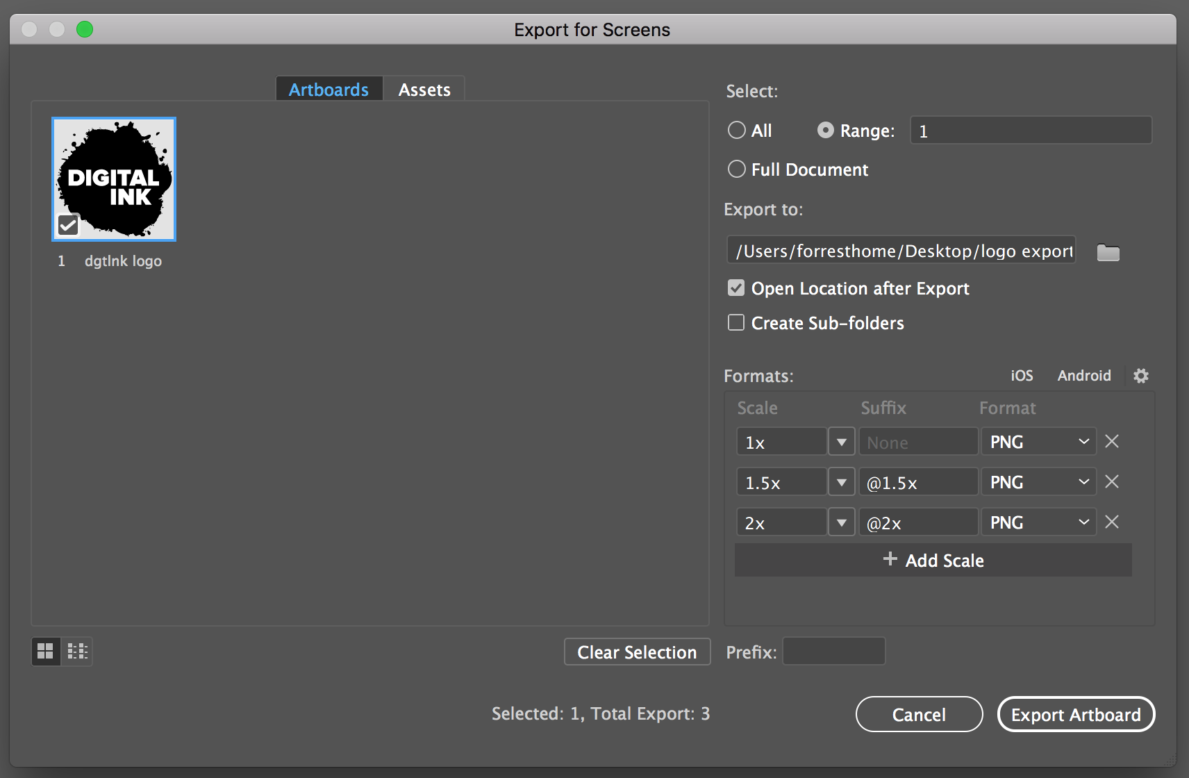
Retina screens have around twice the resolution of the standard screen resolution (72 ppi). Because of this, a lot of images that looked good on those old displays look blurry and pixelated on newer displays. A way to fix this in your designs is to combine media queries with functions like the ‘export for screens’ function found in Adobe Illustrator to create multiple versions of the same image that can be displayed depending on the display resolution.
For example, a Macbook retina laptop is 220 ppi. A standard screen resolution is 72 ppi. You can use the CSS resolution property to ensure that the right image is displayed for each.
Here is an example of the correct syntax:
/* Exact resolution */
@media (resolution: 220dpi) {
  p {
    background-image: /images/dgtlnk-logo@1.5x.png;
  }
}

/* Minimum resolution */
@media (min-resolution: 72dpi) {
  p {
    background-image: /images/dgtlnk-logo.png;
  }
}

/* Maximum resolution */
@media (max-resolution: 300dpi) {
  p {
    background-image: images/dgtlnk-logo@2x.png;
  }
}
Once you’ve decided on the screen resolutions you need to account for, you can use Illustrator’s asset export function to create the images you need. You can see in this example with our logo:
Assuming CMYK and RGB Colors are the Same
The way that colors are rendered on a display is very different from how they’re rendered in print.
On a screen, color is created by a combination of red, green, and blue (RGB) toned pixels, while colors in print are rendered via a combination of 4 colors: cyan, magenta, yellow, and black (CMYK).
The mistake that non-designers often make is assuming that colors will look the same way on screen as they do in print. Sadly, that isn’t always the case.
The best way to prevent this mistake from happening is to constantly double check your color usage. For example, let’s say you need to create a print design based on the colors from a website.
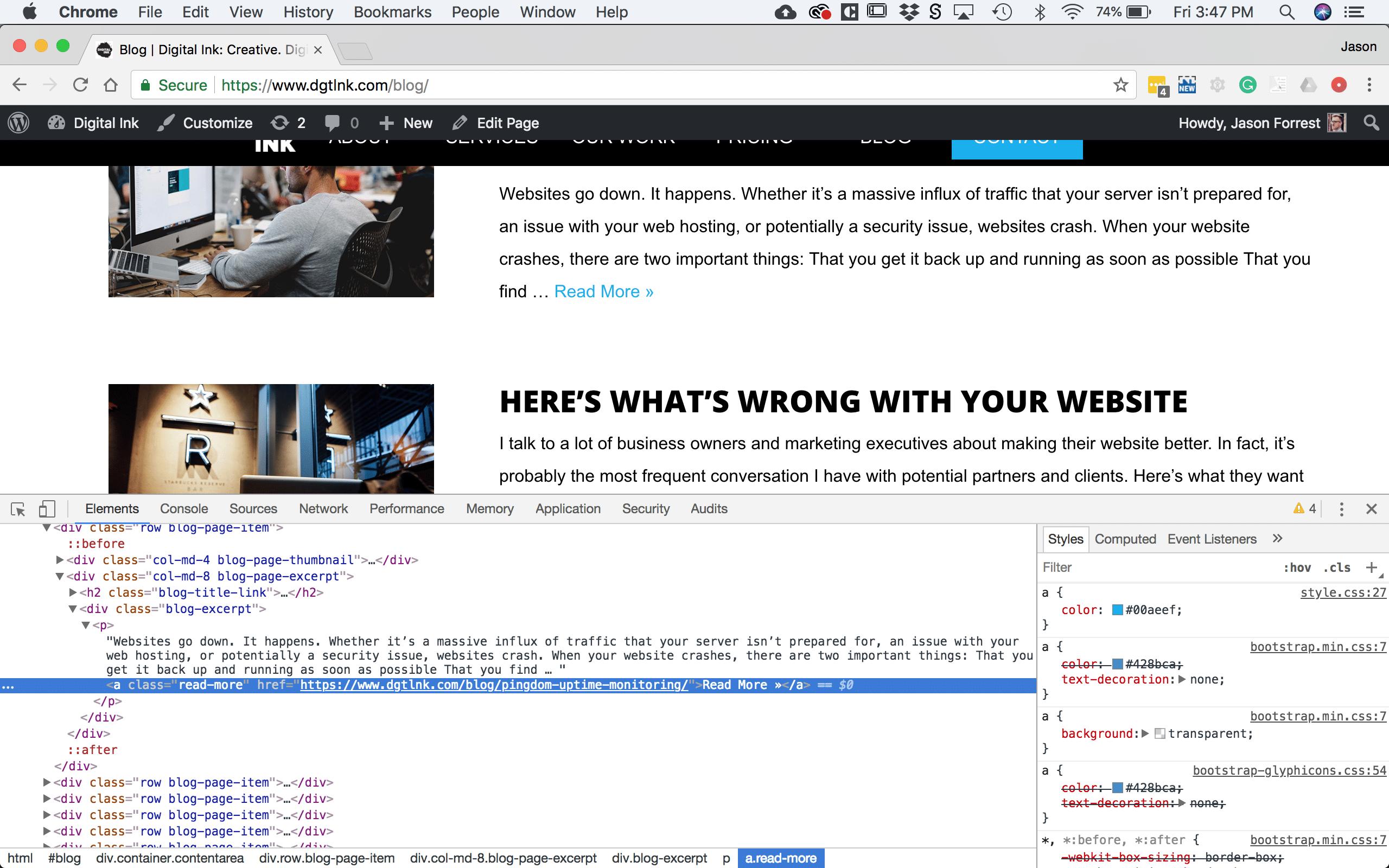
Start by using the Inspector to grab the hexadecimal code:
Once you have that code (#00aeef), plug it into a tool like Adobe Color to get the CMYK color code (C=100,M= 27, Y=0, K=6).
This will ensure that your print colors will be as close to the digital versions as possible. Bear in mind, however, that it still might not be exactly the same.
This is why when you create a style guide, you start with Pantone swatch tones and generate the correct RGB and CMYK color codes from there.
Here is a handy tool to help you do that.
Poor Contrast
We spend a lot of time creating hero images for websites.
Besides the difficulty of finding decent stock photos, it’s important to make sure that the text on top of the images is readable.
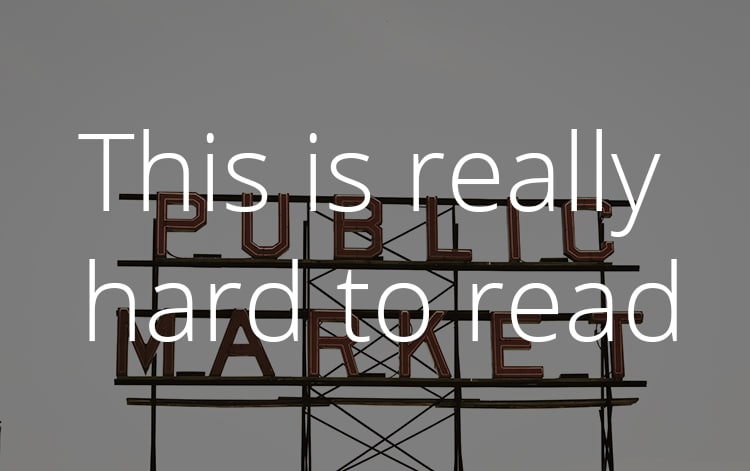
A common mistake is using colors, photos, and text that, when combined together, have poor contrast and make the text difficult to read. The easiest way to avoid this mistake is to start with a good quality image.
Some basic criteria for good contrast are:
- Simple, abstract subject matter
- Avoid bright colors
- Avoid photos with lots of text
- Pair with heavier weight type
This is an example of good contrast:
You can also play around with adding brighter fonts to make it jump out even more. I suggest looking at a color contrast checker like WebAIM to ensure that your colors meet accessibility standards.
Bad Cropping
We work on a lot of PowerPoint presentations, and the number one mistake we see with them is bad photo cropping. Focusing on good cropping will greatly improve your designs.
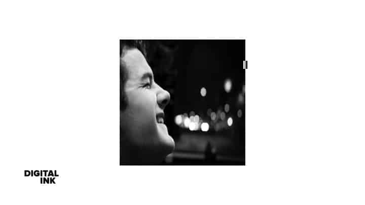
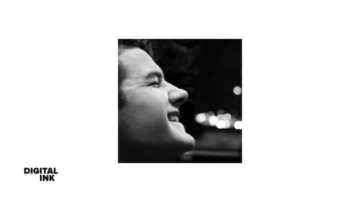
Here’s the golden rule of photo cropping: always scale a photo or graphic proportionately. The width-to-height ratio has to stay the same as when you inserted the image into your design. Despite the fact that so many people use PowerPoint everyday, it seems like very few people know there is a great built-in cropping tool.
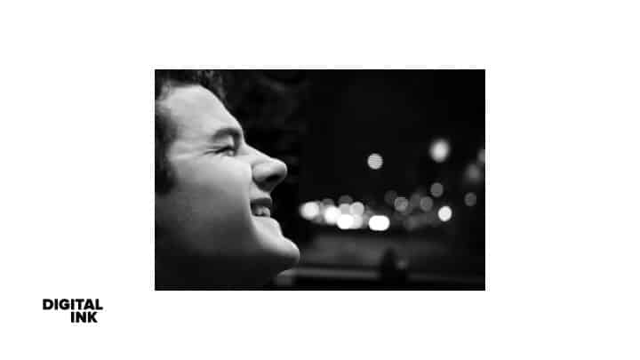
Take this image. It currently has a rectangular photo inserted on the middle of the slide. You decide that you want it to be square and cropped so the man’s face is more centered in the image.
This is the wrong way to do it:
This is the right way to do it:
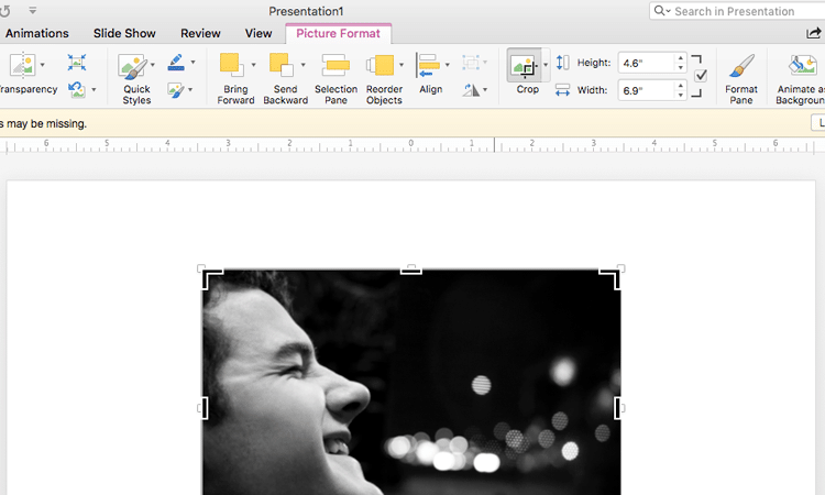
To use the crop tool, found under the “Picture Format” tab, first select the image you want to crop, then click on the “crop” button.
You’ll see large black anchors on each corner and at the top and bottom of the image that control the crop area. You can scale it proportionately by holding Shift while clicking and dragging the anchors. The smaller anchors control the size of the actual image.
Hold shift while clicking and dragging to ensure the image scales proportionately. You can also move the image within the crop area by clicking and dragging on the image.
These are only a handful of the most common mistakes we encounter. If you find you’re still struggling with graphics mistakes, contact us. We’re always happy to help.
