Minimalist Design: Is it Right For You?
by Jason Forrest
Insights / Graphic Design /

So you’re intrigued by this minimalist design thing the kids are talking about today.
You see it on your Pinterest, you see it on your Tumblr, and you see it on your Buzzfeed.
You’re thinking you might want to use it for your project. But should you?
Here’s how you can decide if minimalist design is right for you.
The Pros of Minimalist Design
Let’s deal with the obvious first. It is stylish. If folks were being honest, the aesthetic of minimalist design would be the first reason you’d be given for why it is so appealing to designers. We tend to flock to it like anthropomorphic bears to picnic baskets.
Simplicity eliminates distractions. Because of how bare bones minimalist design is, it focuses a viewer’s attention on exactly what you want them to see. The lack of superfluous elements also means that a user can quickly access your content.
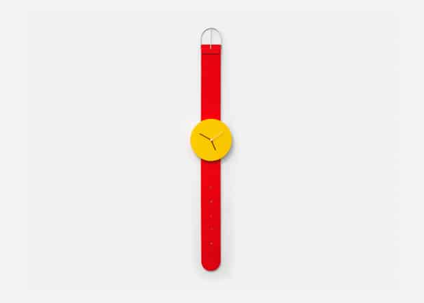
Accents stand out. If we logically assume that the viewer’s attention is laser-focused, any accents will jump out at them because of the high-contrast inherent in minimalist design. Think of it like being in an all-white room with a single candy red door. You’re going to notice it.
It adapts well to a responsive layout. This is easily the most practical reason for going with a minimalist design. Take the story publishing blog Medium as an example. There are two main design elements: Large photos and a text column. Such a simple layout makes reading their stories easy on any device.
Hey, hold on there kiddo. Don’t drink the kool-aid just yet. We’ve not gotten to…
The Cons of Minimalist Design
Oversaturation. Minimalist design has a reputation as overdone, and the thought of it alone can be irritating. Go to almost any culture aggregating blog, and you’ll see dozens of hits for minimalist posters of people’s favorite tv shows, brand logos, sports teams, book covers, video game covers, etc. You name it, there is a Top 10 list of minimalist design takes on it.
Doesn’t lend itself well to a surplus of content. Let’s say you have a ton of content. You are going to be at a loss as to how to do away with enough it without losing anything crucial. And if you carelessly throw away your content to the sacrificial altar of minimalist design, your site will be unnavigable. Some users are used to a certain way of doing things, and might have difficulty finding what they need on your site. That leads us to the next thought, that…
Minimalist design is generally best suited for creative brands. Think about it: Where have you seen a minimalist design approach used most effectively? Creative agencies, artist portfolios, fashion retailers, and purveyors of culture.
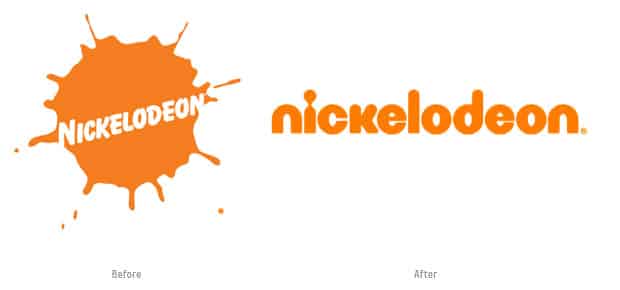
You risk your brand blending in with everyone else. If you scroll through the minimalist design Pinterest board, you’ll notice that all the designs start to look exactly the same. All the grey and white and black can be very boring. Because of how popular it has become, it’s very difficult to stand out above the crowd. An example of this that I have a lot of feelings about is the Nickelodeon logo.
They jumped on board the simplification bandwagon at the expense of their great old brand identity (the “splat”). Now their logo looks like it belongs to a tech blog. And worse, it would be difficult to tell them apart from a half dozen other channels.
The Takeaway
Minimalist design doesn’t work for all projects, or all people. Consider your content and your audience against our pros and cons list, and you’ll be well on your way to knowing if minimalist design is right for you.
Are you still not sure if it will work for you? Contact us and we’ll be glad to help you decide.
Clock photo courtesy of Andrew Neyer


